We Have Severance at Home
For the long awaited season 2 of the Apple TV’s show Severance, I couldn’t sit idly in my fandom– from the frenetic social media buzz to seeing the set recreation firsthand during the Grand Central marketing stunt, the anticipation for the new season was palpable. While watching the first episode, I started to imagine how fun, surreal and satisfying it would be to be inside the retrofuturist world of Severance. By the time the credits rolled, I had decided to throw a finale watch party right in my living room.The finale was set to air March 21, 2025—six weeks away. I had a hard deadline, a budget of $300, extensive design and production experience and a reputation for throwing great events. It was more than enough to say “We have Severance at home.”
Services
Experiential design, Art Direction, Event Production, Graphic Design, Prop Production, Vendor Coordination, Project Management


The Start
I began by creating a production plan for the physical props, anticipating they would require the most steps to produce. Notebook and pen in hand, I rewatched season 1–jotting down items I loved that would make the mysterious fictional corporation of Lumon Industries feel real. I wanted to have the most recognizable items from the first season like Ricken’s The You You Are book alongside niche season 2 items, such as the goat eye charts. This curated mix ensured a truly immersive experience while showing my obsessive attention to detail.
Simultaneously, I mapped out the spatial layout of my living to transform it into the main set, the severed floor of Severance. This meant stripping the room of all art, decoration and color so it would be a completely blank canvas. Also I programmed the lighting, selected music and curated background visuals to create the sterile, cult like corporate atmosphere that defines Lumon Industries.
While rewatching season 1, I came up with several ideas for what activities we could do ahead of the screening of the finale. Most of these activities required not only props, but the coordination of specific characters to lead them so I prepared shorts scripts. For instance, I took on the role of Ms. Casey who conducted custom wellness sessions for each guest. Acting as the counselor, I read off specific, comforting facts about each guest's "outie." To prepare for this, I quietly spent the weeks leading up to the party taking notes on guests–observing hyper-specific habits, quirks, and preferences to make each session feel as authentic, fun, and as delightfully surprising as possible.

Production Logistics
Early on, I set up a master operational spreadsheet to track everything end-to-end: I ranked items by priority, embedded sourcing links for vendors, monitored costs against my tight $300 budget, set quantities and tracked each the production statuses—including the tasks I delegated to friends who helped execute key pieces. Seeing the tangible progress in the spreadsheet kept the workflow manageable, even if it was slightly crazy for one person.
![]()
![]()
The production was a particularly challenging undertaking because Severance is known for its impeccable attention to detail. The precision in every aesthetic detail creates the unnerving atmosphere that is so prominent in the show. That meant making low-fidelity replicas or interpretations wouldn’t work and meticulous sourcing would make a big impact. Operating with a small budget and limited timeframe meant I had to prioritize strategically to get the most impact out of what I made.
![Season 1, Episode 3 team photo]()
![My Season 2 finale party team photo]()
High-priority items included character-defining assets like custom badges and pins, alongside the most recognizable environmental elements that anchor the world of Lumon: the green floor, the MDR terminal, and the food. Secondary items were props designated for planned activities, such as Miss Huang’s red ball and the board speaker.
Early on, I set up a master operational spreadsheet to track everything end-to-end: I ranked items by priority, embedded sourcing links for vendors, monitored costs against my tight $300 budget, set quantities and tracked each the production statuses—including the tasks I delegated to friends who helped execute key pieces. Seeing the tangible progress in the spreadsheet kept the workflow manageable, even if it was slightly crazy for one person.


The production was a particularly challenging undertaking because Severance is known for its impeccable attention to detail. The precision in every aesthetic detail creates the unnerving atmosphere that is so prominent in the show. That meant making low-fidelity replicas or interpretations wouldn’t work and meticulous sourcing would make a big impact. Operating with a small budget and limited timeframe meant I had to prioritize strategically to get the most impact out of what I made.


High-priority items included character-defining assets like custom badges and pins, alongside the most recognizable environmental elements that anchor the world of Lumon: the green floor, the MDR terminal, and the food. Secondary items were props designated for planned activities, such as Miss Huang’s red ball and the board speaker.


World Building Through Design
It was of utmost importance to replicate the design language of Lumon because the corporation acts as a dominating character of the show–a faceless villain–mysterious and unsettling.
The graphic style of Lumon draws heavily from mid-century bureaucratic documents and 1970s pharmaceutical branding. I tracked down and utilized the show's exact typefaces to design the custom materials: Manifold Extended CF for the wall signage, Forma DJR for the invite and music menu and Input sans for the iconic Hang in There! poster. Forma DJR, which is used on all internal documents, looks almost friendly, but in context feels soulless and passive aggressive, creating the perfect atmosphere of corporate oppression.
To replicate the printed collateral, I first digitized the core Lumon brand system. I vectorized the primary Lumon globe logo and the teardrop icon, matched the exact color codes, and organized the typography into a brand asset library to maintain visual consistency across multiple props and touchpoints.


Props
Using this asset library I created, I started designing and producing all the print materials in my home design studio. Things quickly came to life like the laminated green music menu that Helly uses to select “defiant jazz” for the party in season 1, room signs set in the futuristic Manifold font throughout the set of the severed floor, the missing Miss Casey flyers and the mysterious goat eye charts. For large items and high fidelity prints such as Rickon’s book and Dylan’s Hang in There! poster, I had them professionally printed.


Ricken’s book, The You You Are was the most challenging, tedious, and rewarding item to create. It is an absurd, overly profound self help book, written by the main character’s self absorbed brother in law. In the show, viewers only see the front cover so I had the creative freedom of making the back and two inside jackets to make the prop come to life. Using an existing red hardback book as a base, I measured and mapped out the dimensions so the new custom jacket would fit perfectly. Apple TV’s marketing team had previously released a brief digital excerpt, which gave me a great deal of excellent source material to pull from and expand upon. I matched every typeface and drop shadow, wrote a satirical author bio and note, and pulled reviews from real fans on Apple Books. Once professionally printed, I hand-cut, scored, and wrapped the jacket at home.


To stretch the budget, reduce unused material and get the exact color matches, I created the Lumon staff ID badges by hand. I repurposed old cards using spray paint and acrylics, and sourced paracord in the exact shades of Macrodata Refinement blue and Optics & Design green. Using a standard hole punch, sculpted silver wire, and spare keyrings, I assembled the lanyards one by one.
I wanted attendees to leave with something as well, so as a party favor, everyone received a Lumon blue balloon featuring their own faces, inspired by the ones Mark S. receives from Mr. Milchick. Did you know you could apply temporary tattoos on latex balloons? I prototyped the guest portraits at various scales and contrasts to ensure clarity, sourced the precise corporate blue balloons, located a cost-effective local helium supplier, and hand-applied the graphics. They were a huge hit!


For the floor treatment I enlisted the help of my friend who suggested utilizing seamless green-screen photography backdrops. Coincidentally, the chroma-key green was an exact match with the color of the carpet from Severance's MDR set! I sourced the perfect dimensions for just $35. This required traveling to B&H on 9th Ave and 34th and then maneuvering a 8ft tube through the subway during rush hour traffic back to my home near Prospect Park. It was entirely worth the effort—the results speak for itself.
[video here]


Experience Design
The actual event needed to feel incredibly fun and immersive–a tribute to the quality and brilliance of the show. I kicked things off by sending out digital invitations that were designed to look like Lumon Industries paperwork. I composed a severe sounding message to send alongside it.


In an authoritative corporate tone, it read:
Corporate Mandate: Severance Season 2 Finale Viewing
Dear Valued Team Member,
Per corporate mandate, you are hereby summoned to an after-hours engagement at [REDACTED] on March 21 at 6 PM for an authorized screening of the Severance Season 2 finale. Approved provisions (food & beverages) will be available, and proper attire (costumes) is compulsory. Nonattendance is, of course, a personal choice–one that will be documented accordingly.
With authorized enthusiasm,
Management
When guests RSVP’d, I replied as Lumon, bureaucratic and cold.


The night’s itinerary was full: we recreated the ball game led by Miss Huang, toasted over “reintegration shots” made of ginger juice and rum served by the character Reghabi, conducted wellness sessions with Miss Casey. We even had call with the board to conclude the evening.


Throughout the night, guests interacted with a physical MDR desk terminal I set up, complete with a custom file-refining game where they could capture numbers that felt scary. Food was inspired directly from the show: we had an egg bar, carved melon balls and a late-night waffle party served by Mr. Milchick himself.


The Outcomes
Following the event, I posted videos to document the work I did and the party itself. One of the videos generated over 30K views and caught the attention and praise of Severance cast members.
Additionally, Eteng Ettah, a guest at the party, invited me to speak as a guest on the Severance episode of her award winning TV podcast Consider This For Comfort which became the podcast’s most-listened-to episode to date.


Bonus Track
As if creating 40+ items for the event wasn’t enough, I simultaneously launched an Etsy shop where I listed my designs as digital downloads so that other fans hosting their own Severance parties could use and enjoy them. This side project took on its own life as the season progressed, ultimately generating enough revenue to entirely recoup my original production budget. As a result of the shop, the video and sharing my work on this event, I have since received inbound client requests to license my design work and to produce custom props for independent projects.
Praise Kier!


Depop LIVE — New York
Depop brought its app to life in SoHo for its first major North American retail activation: a free, two-day experience open to the public, with vendor stalls, talks, workshops, and performances.
Services
Graphic Design


I worked on the design team for the event, contributing to merch, environmental signage, and digital ads promoting the weekend. It was a large, fast-paced effort—a team of many people working across London and New York—and an introduction to what large-scale event design actually demands and the satifaction of a job well done.


Turning the Tide Against Plastic
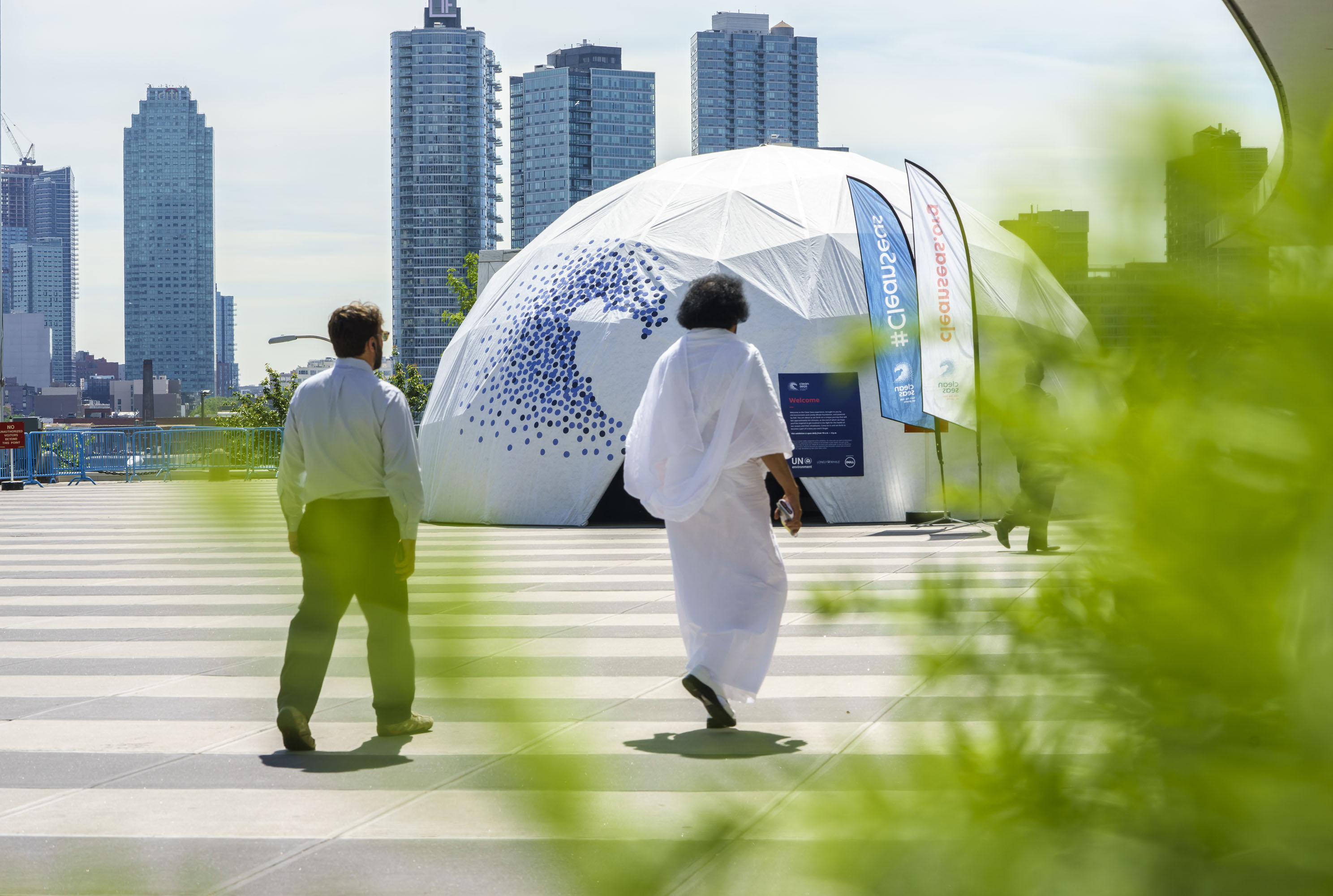
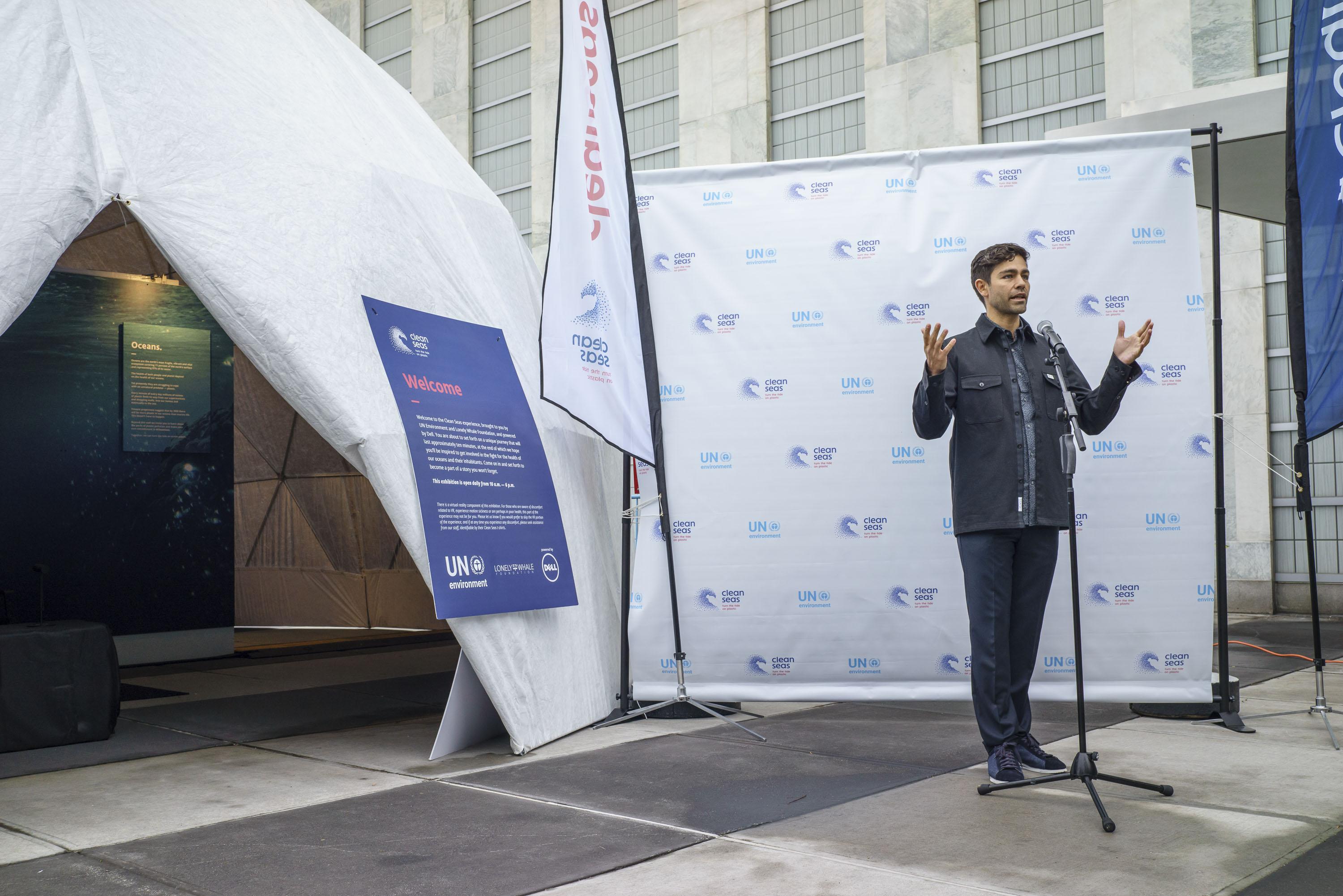
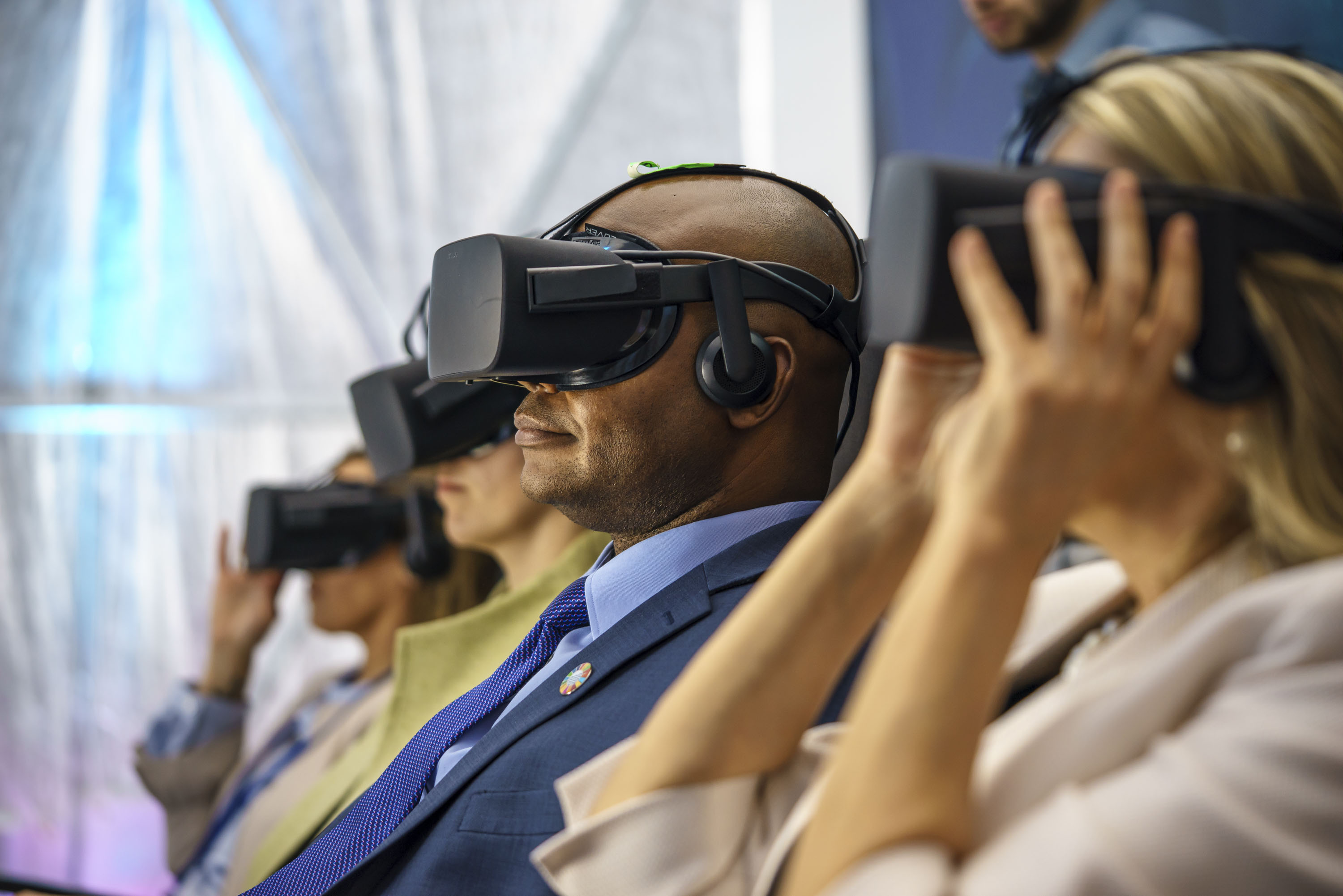
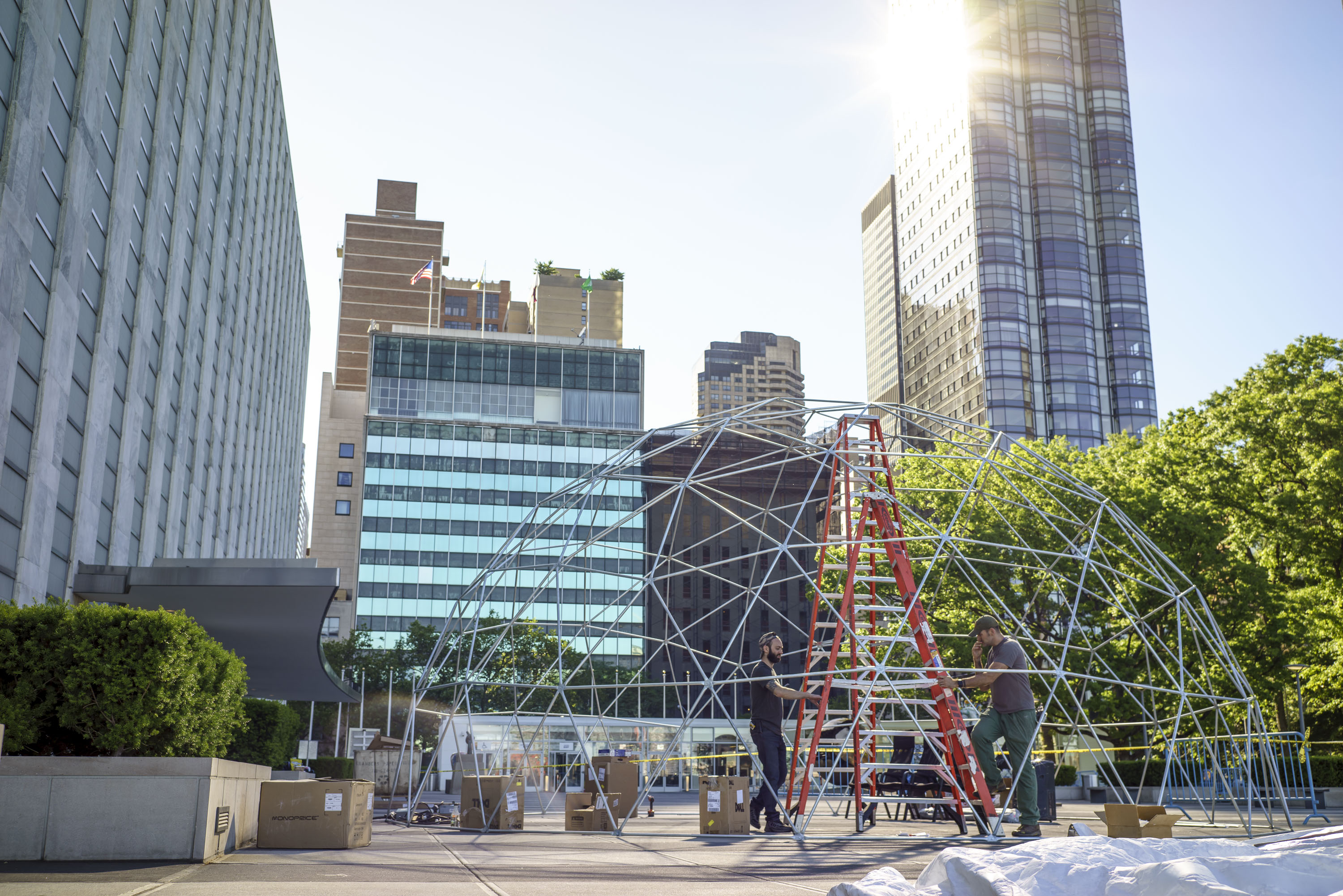
The United Nations Environmental Programme launched the Clean Seas campaign with the aim of engaging governments, the general public, civil society and the private sector in the fight against marine plastic pollution. The campaign had many parts, but it started with an interactive dome in New York City which later travelled to Nairobi, Kenya. Thousands of people including delegates from around the world visited the dome and pledged to fight pollution in the ocean. The dome featured an VR experience by the Lonely Whale Foundation and Dell where participants could witness what ocean life experiences as a result of our pollution. Celebrities like Ellie Goulding and Adrian Grenier promoted the campaign and served as UNEP goodwill ambassadors.
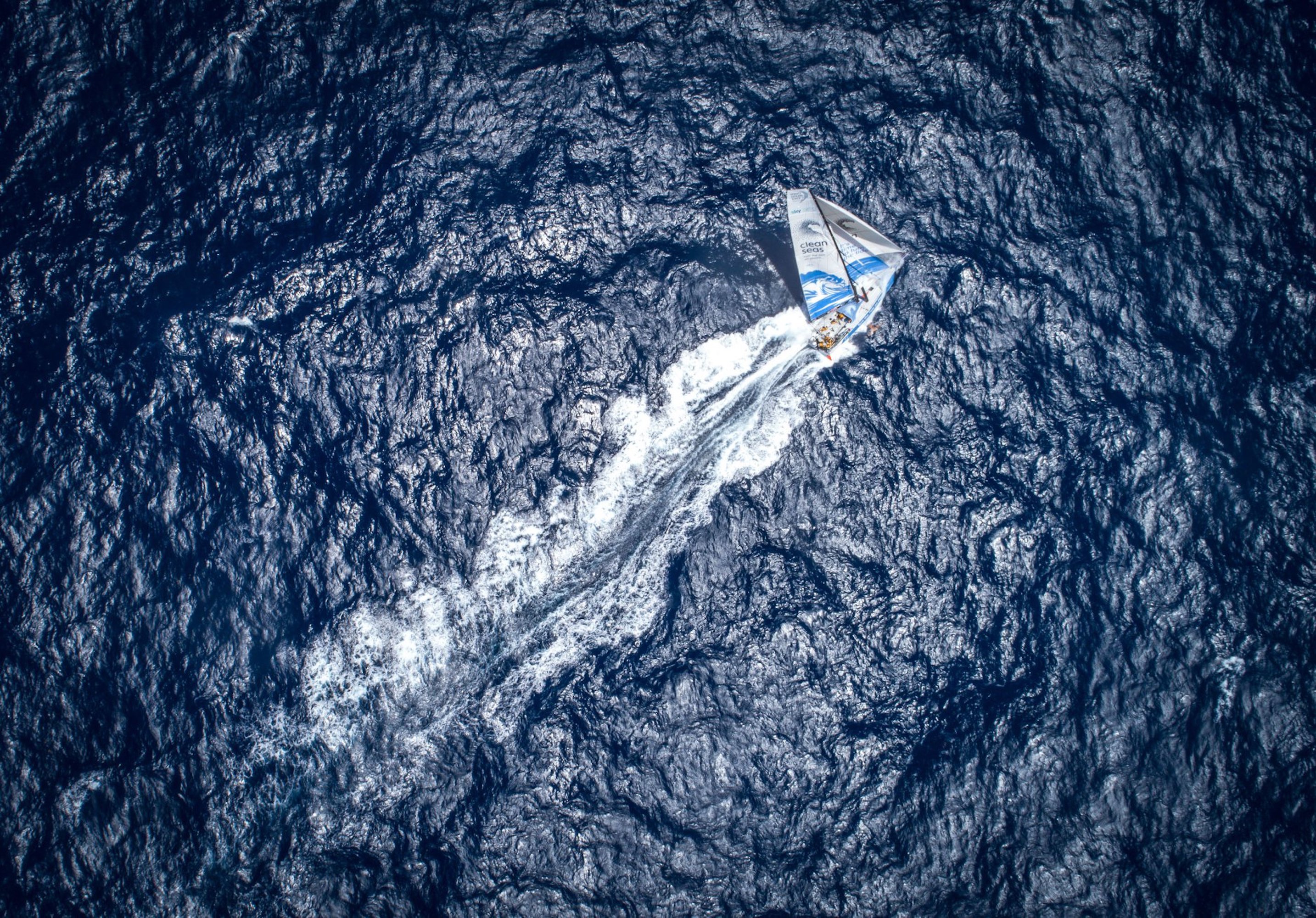
The UNEP also partnered with the Volvo Ocean Race where a team raced the Clean Seas sailing yacht to some of the most remote regions of the world spreading the message, educating young sailors and conducting scientific research on microplastics.
Clean Seas Campaign Website
Volvo Ocean Race Video
Clean Seas Campaign Launch Video
Services
Branding, Graphic Design, Event Production
Studio
The Public Society
Photography
Josiah Werning, Beau Outteridge, Richard Edwards, James Blake
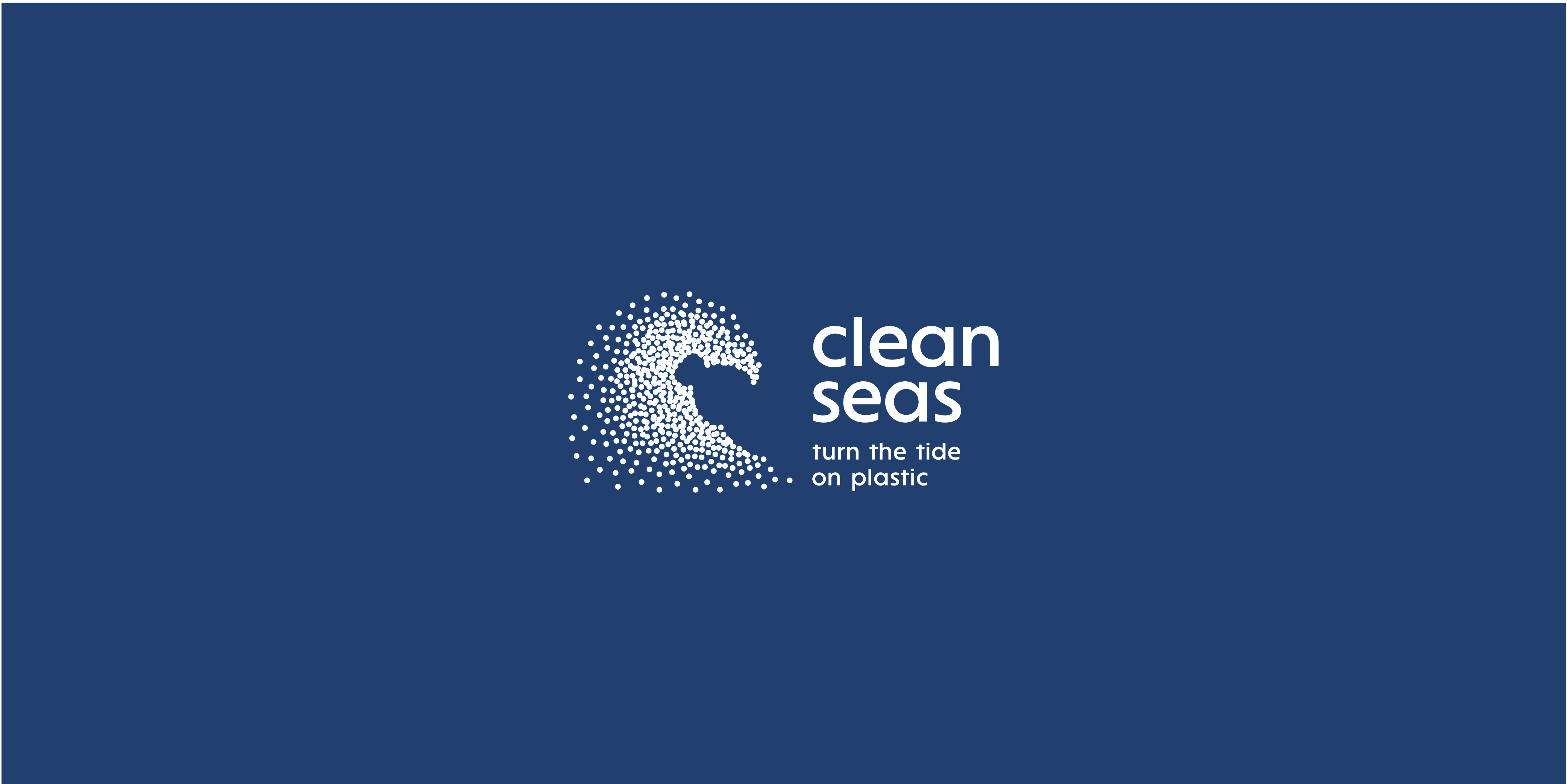
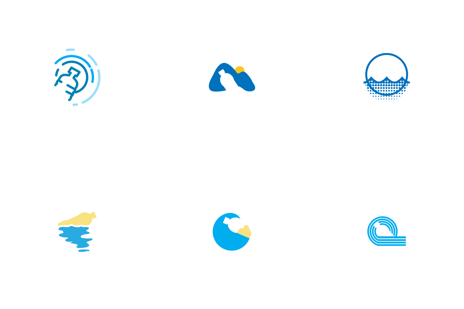
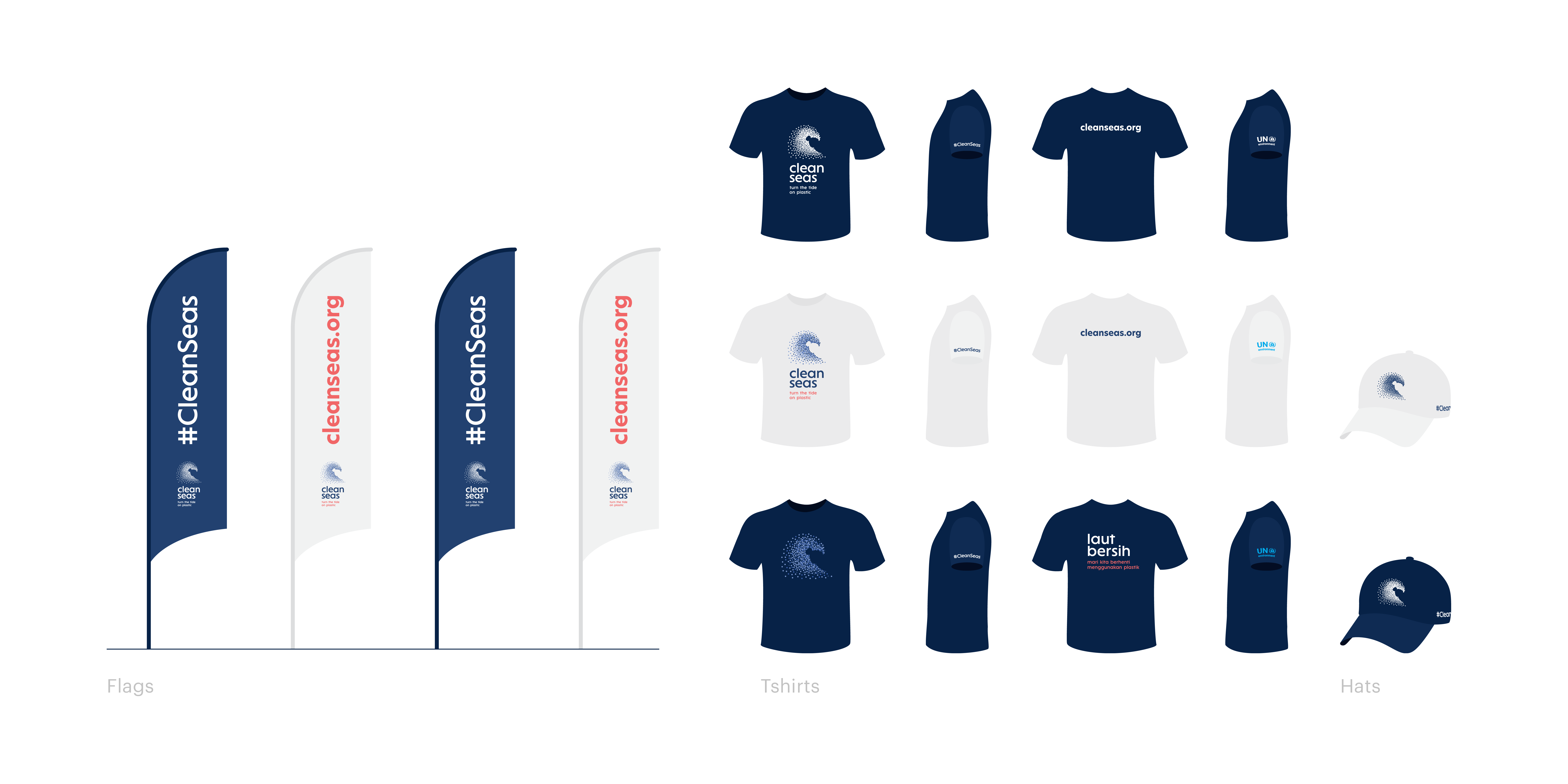
As a part of the identity team, I helped design the CleanSeas logo (including several options, the runner up version and the final version). The logo embodies both the subject of marine plastic and the metaphor about our ability to turn change the course of ocean pollution. Our logo features a wave that is formed by gathering dots in different shades and density. The dots are a representation of microplastics, the most prevalent plastic debris found in the sea. The negative space within the wave mark illustrates a plastic bottle, the most universally recognized representation of plastic waste.
Sketches
![]() Runner Up
![]()
 Runner Up
Final Identity
Typography & Color


Applications
United Nations Event
Video: Clean Seas in Nairobi, Kenya with Ellie Goulding
Video: Clean Seas in NYC with Adrian Grenier

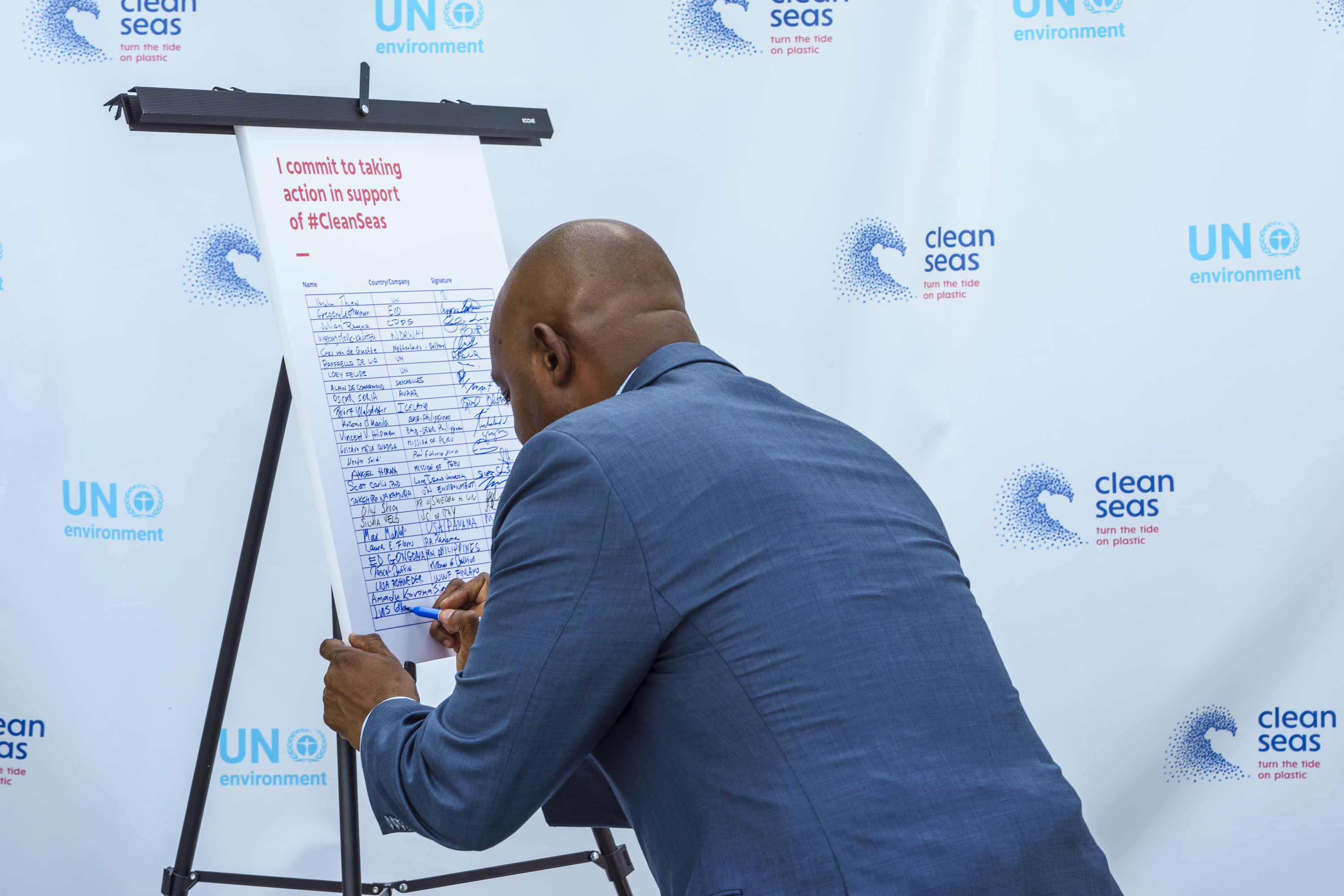
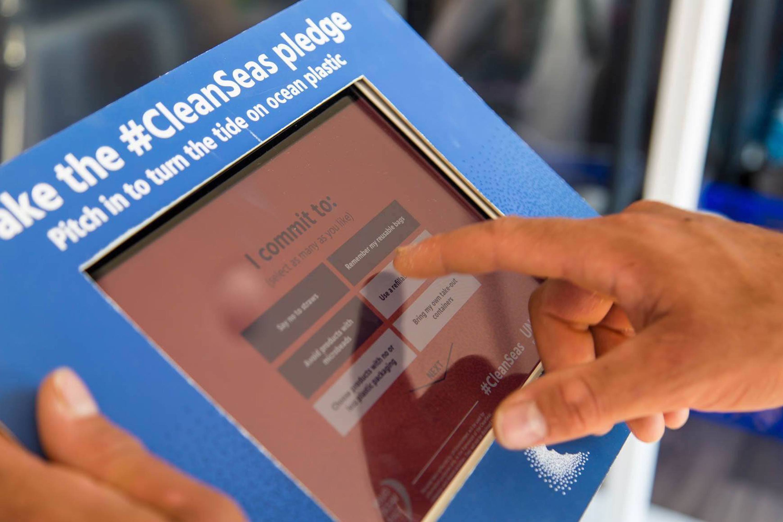
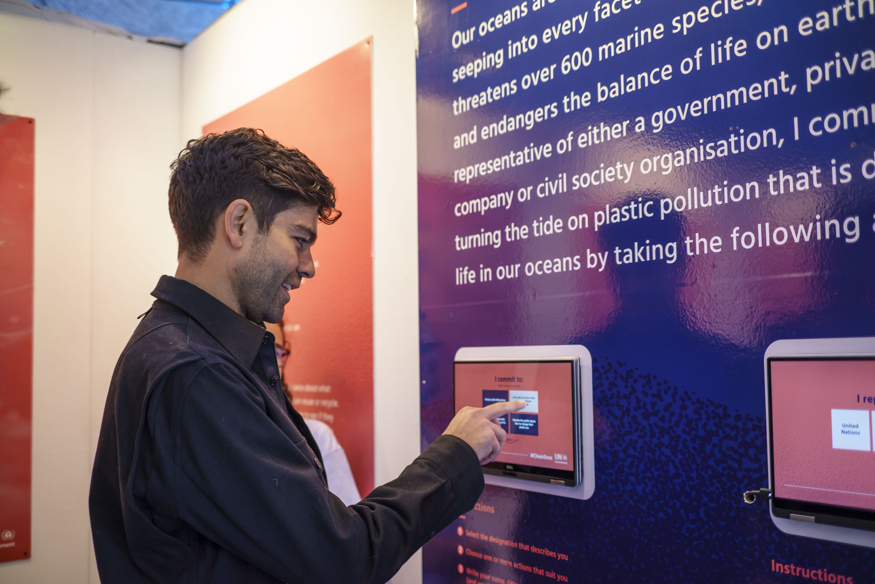
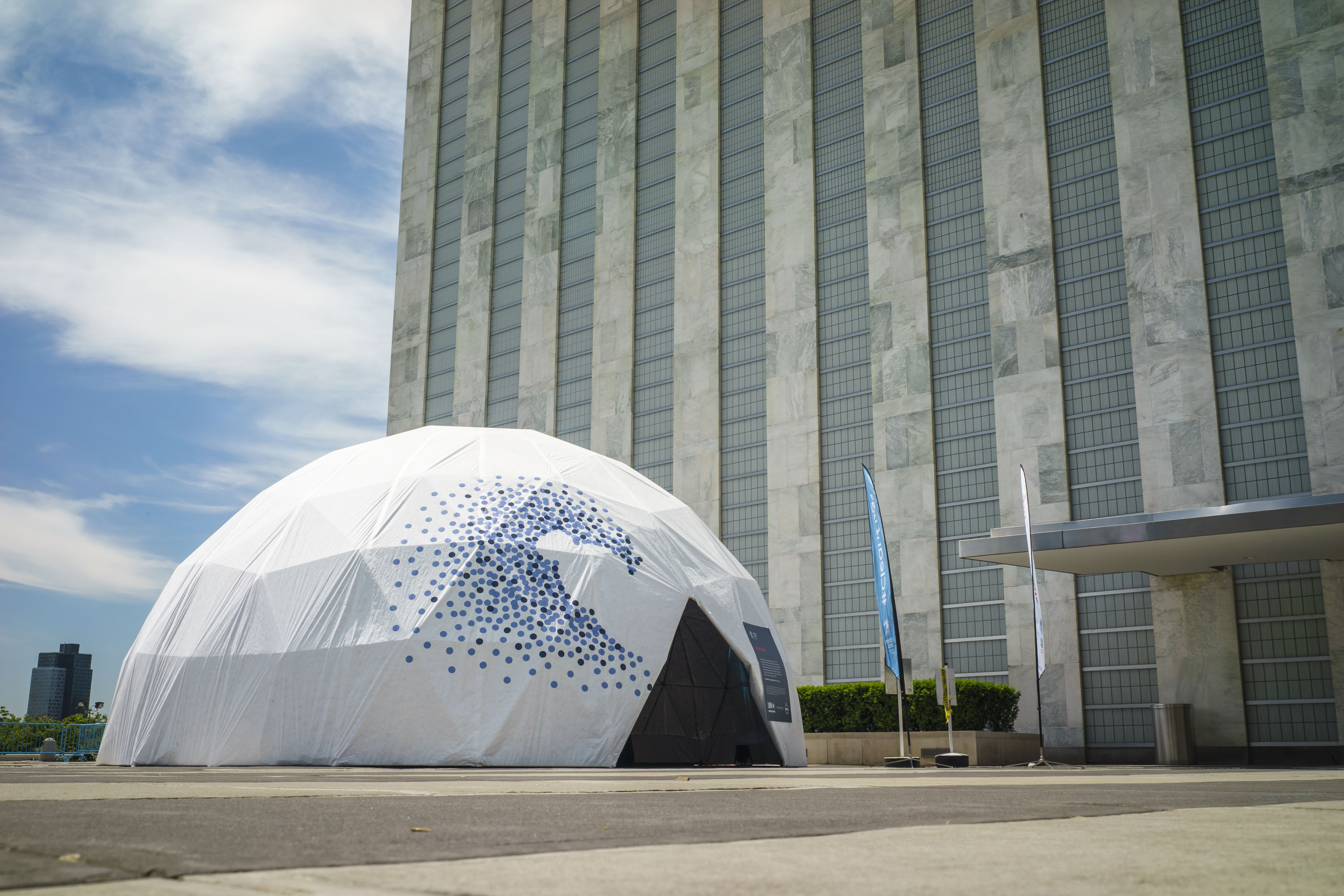
Volvo Ocean Race



Video: Clean Seas Two Year Anniversay Video
Behind the Scenes
![]()
![]()
![]()
![]()


Brand New Conference After-Party — New York, September 2013
The Brand New Conference is a one-day event organized by UnderConsideration, focused on the practice of corporate and brand identity—a direct extension of the popular Brand New blog, with speakers from global consultancies, in-house teams, and small firms. In 2013, it took place on Friday, September 13 at the SVA Theatre in New York.
Services
Art Direction, Event Production, Graphic Design, Vendor Coordination, Photobooth Setup & Event Staffing


That date—Friday the 13th—set the tone for the after-party. The Public Society, the after-party sponsor, staged a photo booth built around gory tools of the design trade. I developed the props and led design and production, coordinated with the venue, and managed the lighting setup and the makeshift booth itself—including automating the booth's image output with a Friday the 13th logo we recreated. Props were designed and printed, then mounted on foam core, cut, and painted by hand. The best part was watching people have so much fun with it.


