We Are In the Active Process of Becoming
Case Study
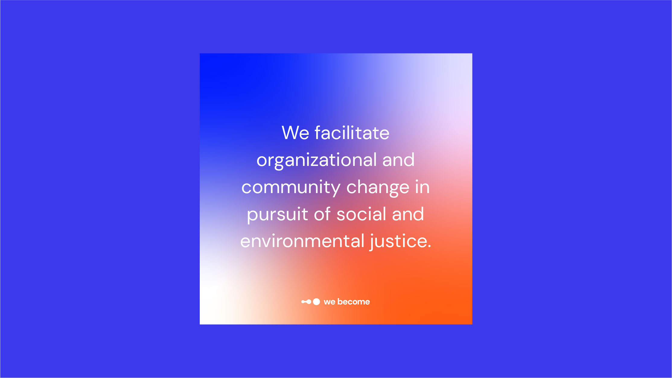
We Become is a bold new collective that uses somatic design to increase wellbeing for mission driven businesses, governments and nonprofits. Somatic design (also known as embodied design) is a healing centered method that focuses on the mind, body and spirit. Through coachings, consultations and courses, We Become works hard so people can experience more happiness, agency and belonging.
Overview
After going through a few iterations their first year, We Become was ready to grow, but they needed a hand. They were at a place where their mission and vision were refreshed and clear, but their branding was confusing, inconsistent and difficult to use. This misalignment was stressful for founder Em, who wanted their brand to feel more professional. Em felt they knew how their brand should look and feel, but couldn’t articulate how to get there or create it on their own.
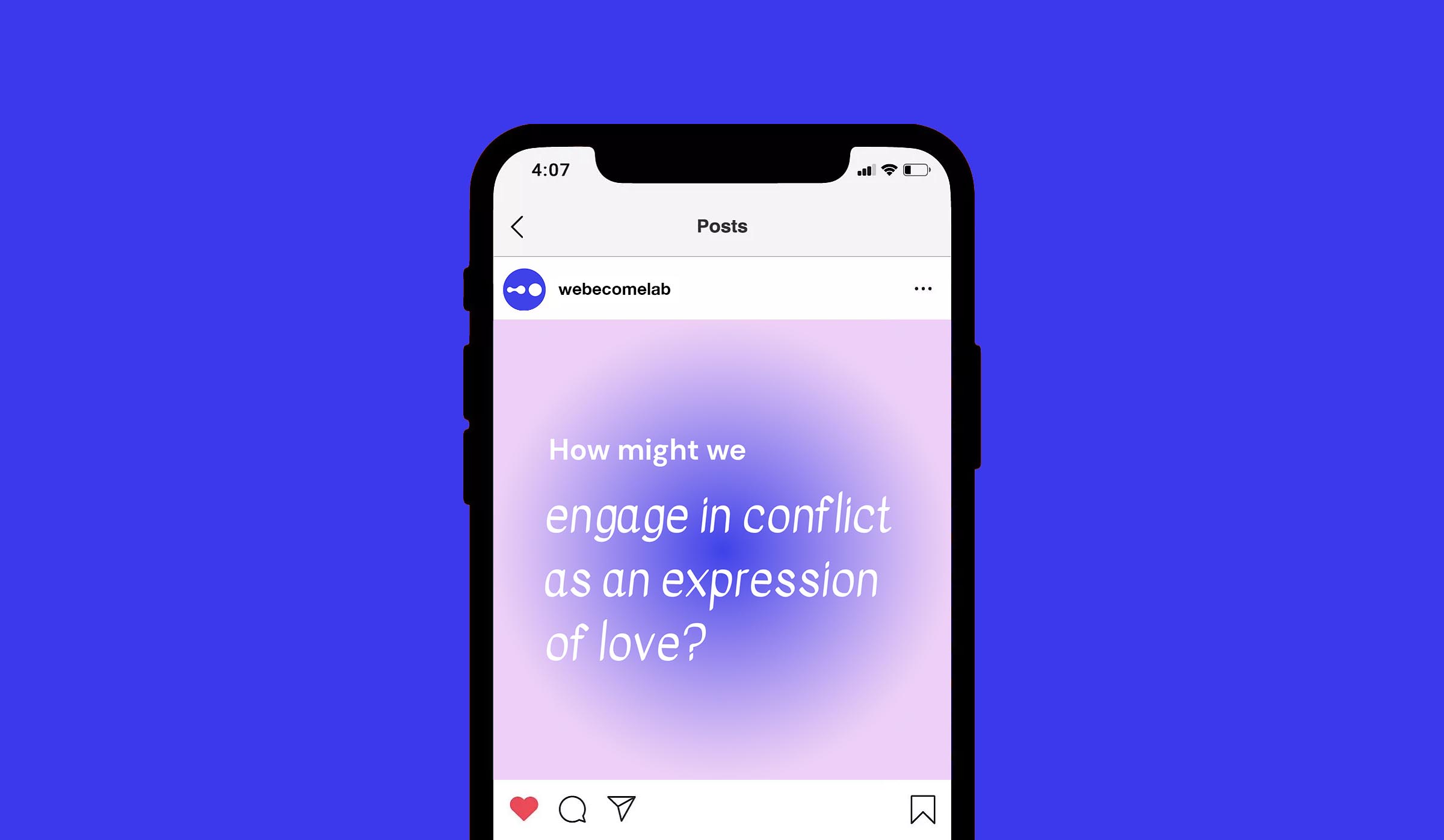
We Become was about to launch the Embodied Action Lab, a community based six week course for working professionals to slow down, learn body centered skills and realign their ways of working. Participants were united on environmental and social justice values. Time was of essence because We Become was quickly moving into their next phase as an organization and thus wanted a rebrand to communicate to new audiences in an attractive, efficient and accessible way.
Over the course of 8 weeks, founder Em Wright and I collaborated and designed elements of the new branding system such as a logo, fonts, colors, graphics, photography, and iconography.
Services
Brand Strategy, Brand identity, Art Direction, Brand Design, Graphic Design

“Our initial conversations and workshops in particular were incredibly illuminating—the questions and activities helped surface information and ideas that may not have come up otherwise, which set us on a somewhat unexpected course toward exactly where we needed to go for the final design.”
Em Wright
Founder of We Become
Process
We started with a 4 week discovery phase where I conducted workshops in which I got to know Em and understand the goals and vision behind We Become. Our first workshop consisted of both standard questions and creative abstract ones that asked Em to describe We Become in new ways so we could generate a wide net of ideas to work with.
Core Concepts
Early on, we landed on the following core concepts to ground the brand in:
1. We are in the active process of becoming. We believe that We Become represents a flexible process rather than a hard destination.
According to Em:
“Humans have an inner drive to do and become more. We Become evokes possibility, improvement and growth towards goals around equity, justice, sustainability, repair.”
2. We–not you or me alone. The concept of “we” means we can’t do it alone, that we depend on one another. We Become believes in the power of symbiotic relationships and that the best growth happens in community with one another.
3. We Become’s work is multifaceted. It uses methods and tools from a variety of disciplines. The work is also highly collaborative with other design practitioners, partners and communities. Because of this, qualities like being highly adaptive, observant, open and intuitive are essential.
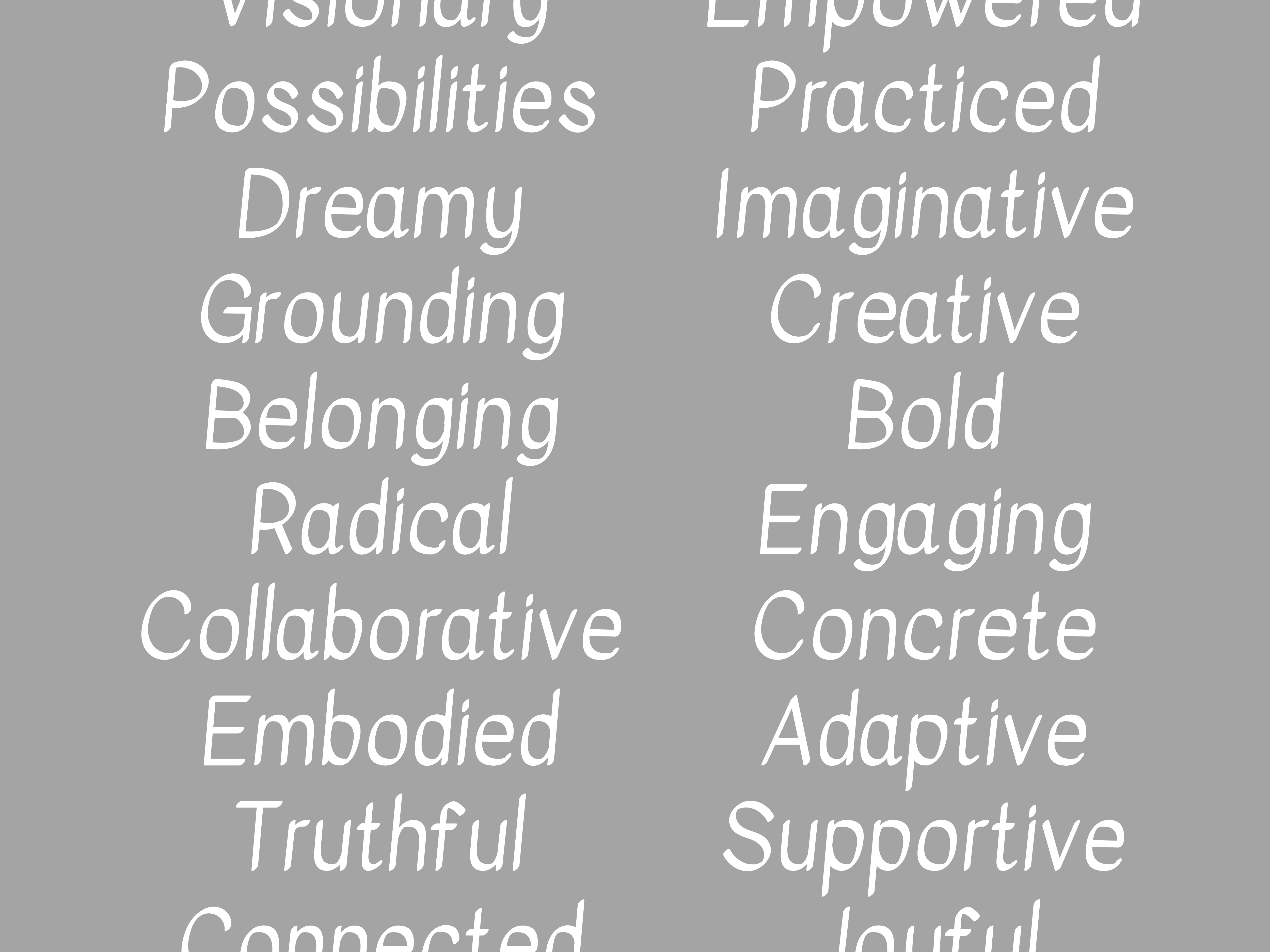
Sample of adjectives generated from a workshop
Focusing the Brand
At the end of this stage, we made a list of 48 adjectives that captured We Become’s new look and feel. From those 48 adjectives, we landed on these five to characterize the new We Become brand: connected, transformative, visionary, accessible and practiced.
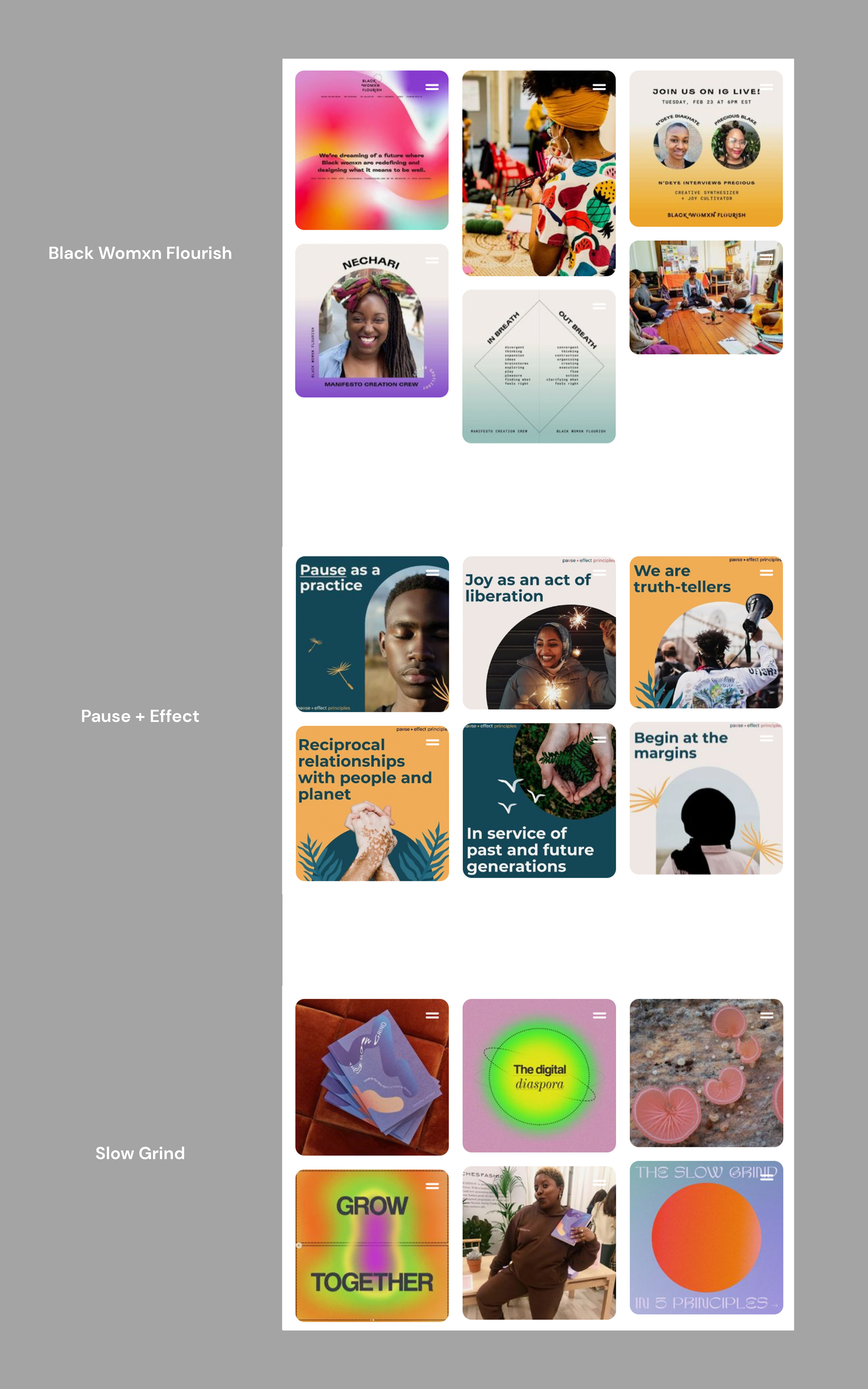
Design samples from Black Womxn Flourish, Pause + Effect and Slow Grind
Brand Literacy
Next we practiced our brand literacy by researching and discussing organizations in the same space such as Black Womxn Flourish, Pause + Effect and Slow Grind. Looking at their work sparked ideas and gave us insight on the approach we wanted to take. It also aligned us as creative collaborators.
We found that we visually gravitated to the combination of flowing forms and futuristic design rather than design that looked static and conventional. We liked the play between graphics that looked at once soft and organic yet bold and contemporary because we felt they inspired curiosity while feeling inviting. The malleable shapes and gradients that we liked conveyed flexibility and adaptation–important brand concepts we established in an earlier workshop.
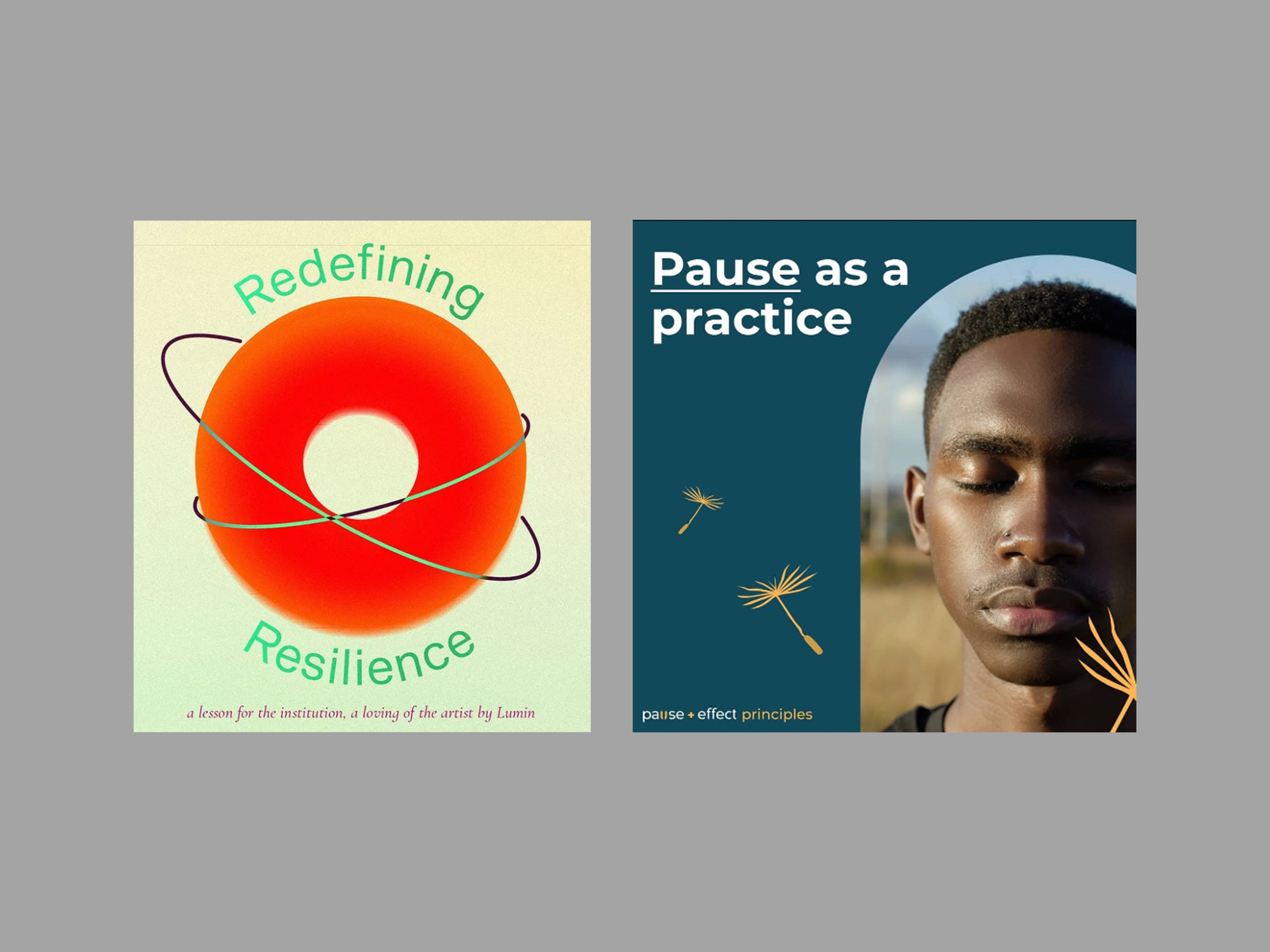
Left: Slow Grind, Right:Pause + Effect
Being Accessible, But Not Didactic
Pause + Effect’s branding started a productive conversation about where on the spectrum from visual ambiguousness to visual explicitness do we want to fall? How can our brand feel accessible without being too didactic in our design?
In designs pairing text with graphics or images–some were more minimal and vague, while others took a clearer, more literal approach. For example: on the left–the design by The Slow Grind visualizes the word “resilience” with a vibrant shape encased by two rings while on the right, Pause + Effect uses a collaged photograph of a person who appears to be meditating to express the words “Pause as a practice”. The forms and colors in the first design are more open to interpretation–perhaps the word “resilience” is communicated through the large strong red donut form, while the word “redefining” could be represented by the hoops holding the red donut. On the other hand, the second design takes less time to understand, the meditating person is in a clear moment of pause, out in nature with their eyes closed.
We discussed that while some We Become clients may want the certainty one feels with literal visualizations (like Pause + Effect)–we didn't, we wanted to give audiences more to chew on. While Pause + Effect’s design was effective in communication, the design felt too static and dated for the We Become brand. We needed more fluidity, poetry and intrigue. During workshops and classes, We Become’s clients are encouraged to be present in their bodies and practice new ways to connect to others in the workplace–something a lot of people may find new and uncertain about. We wanted our brand to include the often intangible and unfamiliar nature of somatic design, but in a way that wouldn’t turn off new audiences.
Moodboarding
The ideas and insights from our discovery phase set us up for our moodboarding exercise. Here we collected inspiration that ranged from illustration, graphic design, fine art and photography. Together we created boards based on our five attributes of connected, transformative, visionary, accessible and practiced. We searched for examples that looked and felt fluid, futuristic and inviting. We kept in mind the early concepts of “we are in the process of becoming”, “we are not alone” and “we are adaptive and intuitive”.
These examples served as our guide–they inspired us, aligned us and visually expressed some challenging concepts of somatic design that we were trying to give form to.
During this process, we explored how we can use branding to position We Become as an expert in somatic design? As we went we asked ourselves, what vision of the future are we designing for and how does that look and feel?
Identity
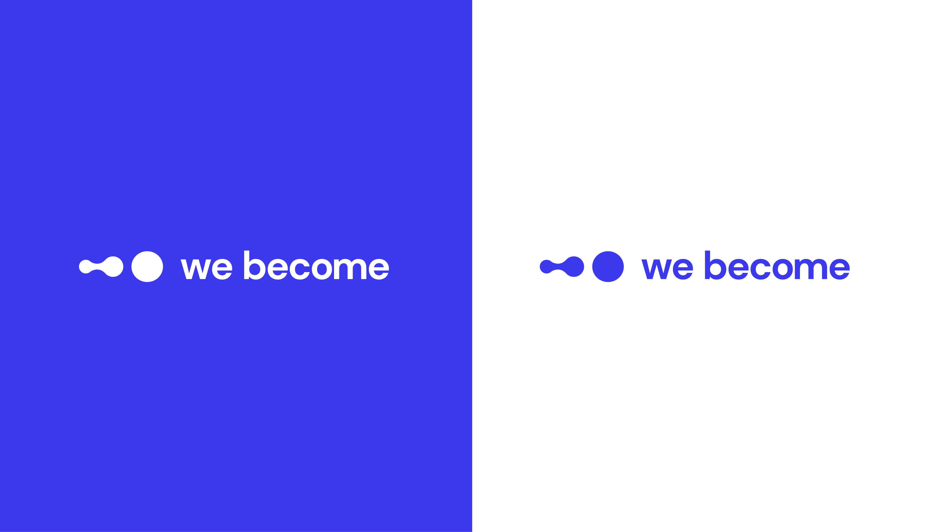
Using the moodboards for alignment and a jumping off point, we next aimed to create an identity that could act as a timeless and universal symbol–something we could see existing now, but also in the distant future. After many ideas and a lot of refinement, we landed on an identity that we felt captured all of our most important brand concepts all while looking friendly, contemporary and simple.
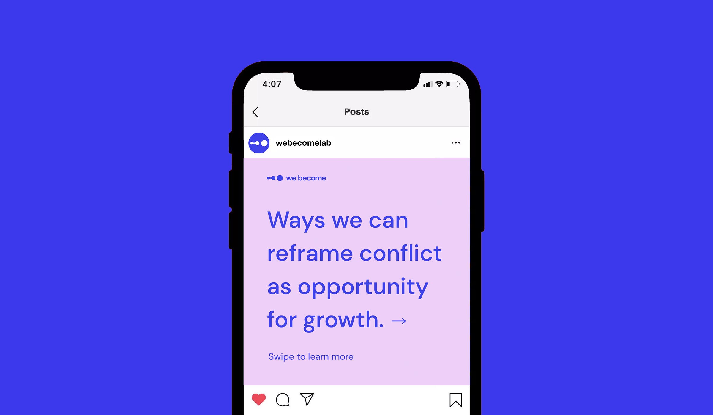
The design embodies the organic nature of somatic design, with two round shapes. To show the process of becoming, we made it so the first shape appears to be morphing so that it will eventually become the second shape. The identity implies change and adaptability.
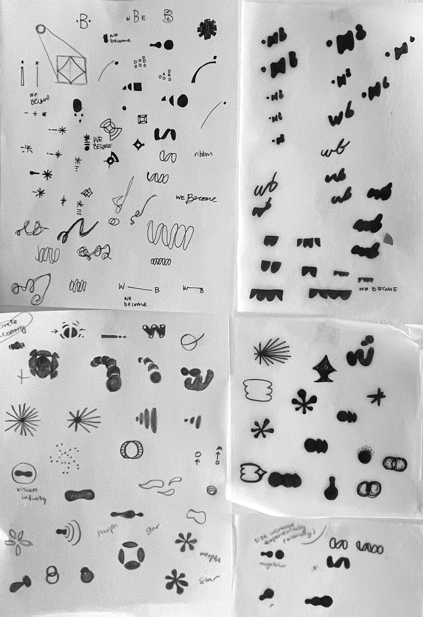
Early sketches

Fonts
DM sans is the primary typeface used in the logo and throughout the brand. As a low contrast geometric sans serif, it is utilitarian, but still extremely friendly and inviting. We chose it for the logo particularly because of the circular nature of the letters like ‘o’ and ‘e’ which mirror the forms in the logo.

Meaningful quotes or stand alone statements however, we wanted a font that had an inviting element for newcomers of somatic design. We looked for fonts with a craftsmanship quality and found Kavivanar. Kavivanar is an unique handwritten font that is slanted, graceful and textural. The letterforms have a calligraphic pen stress that brings a fun rhythm and intriguing aliveness to the letters.

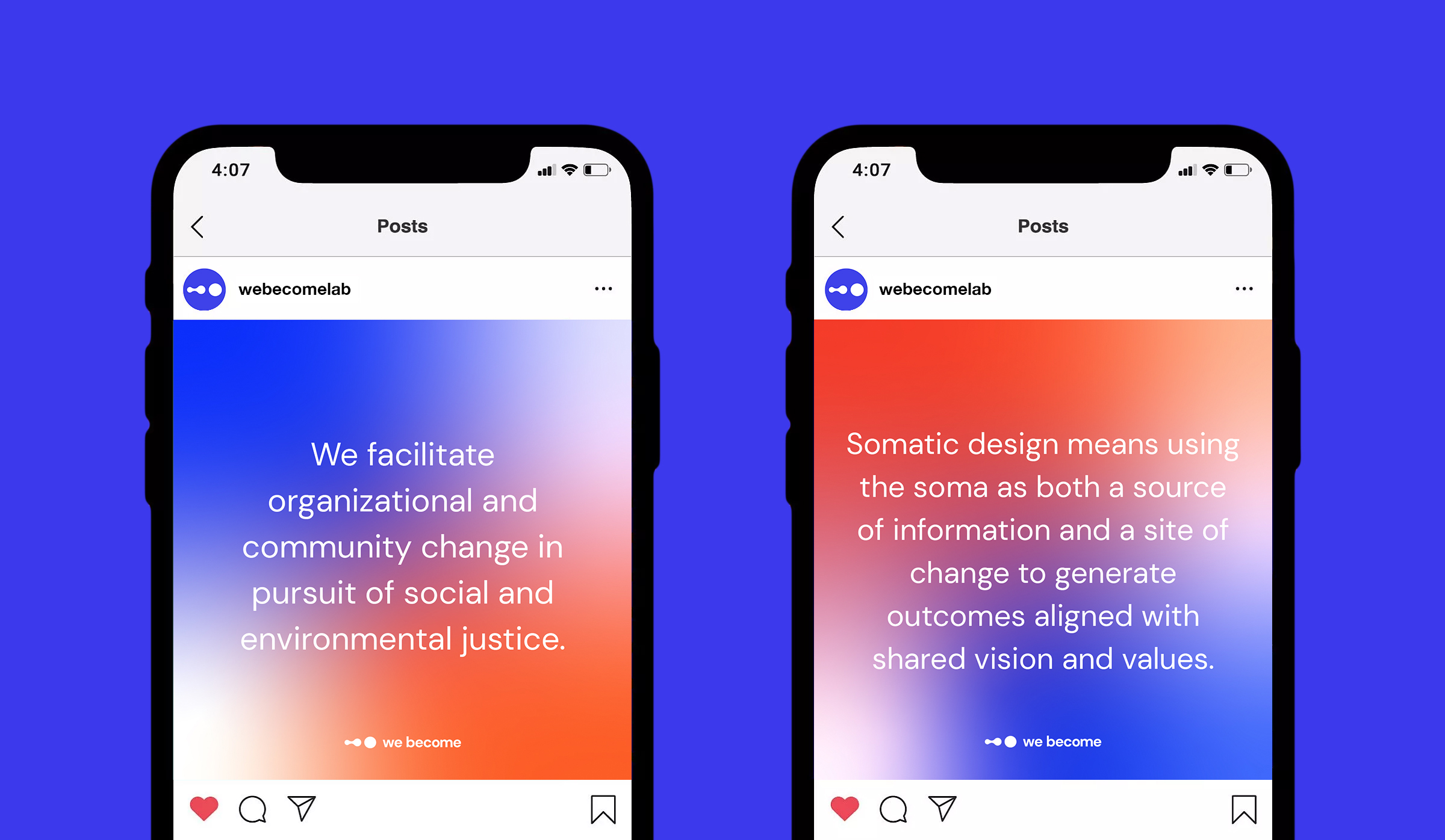
Color and Gradients
To modernize the brand, we embraced energetic colors that felt warm and inviting. We used soft, but confident, attention grabbing gradient backgrounds. These gradients communicated the fluid and intuitive nature of our brand and were designed primarily for digital applications.


Mockups
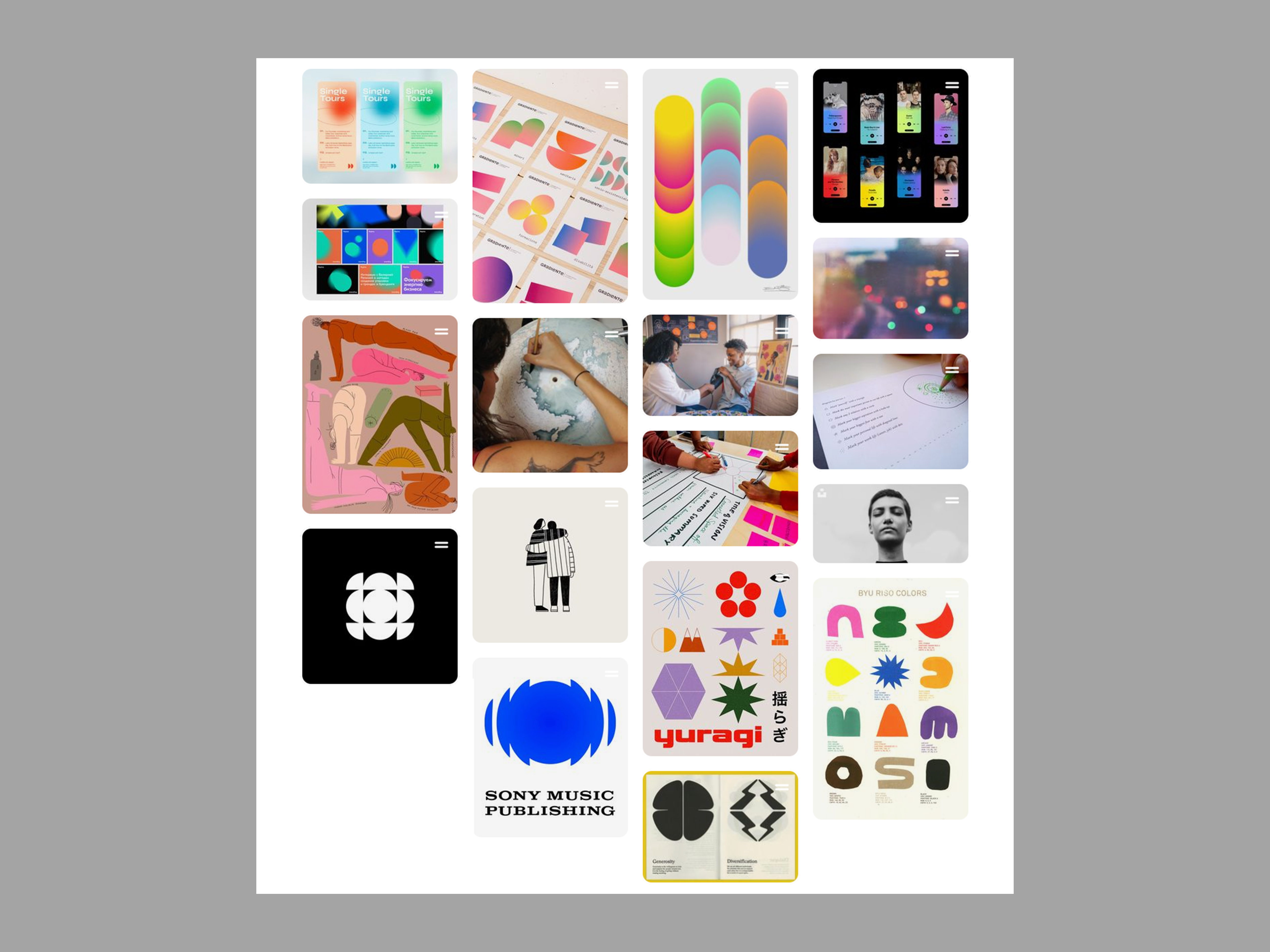
To show how the brand could be visualized, we applied the branding to a website, socials and presentations.

Photography
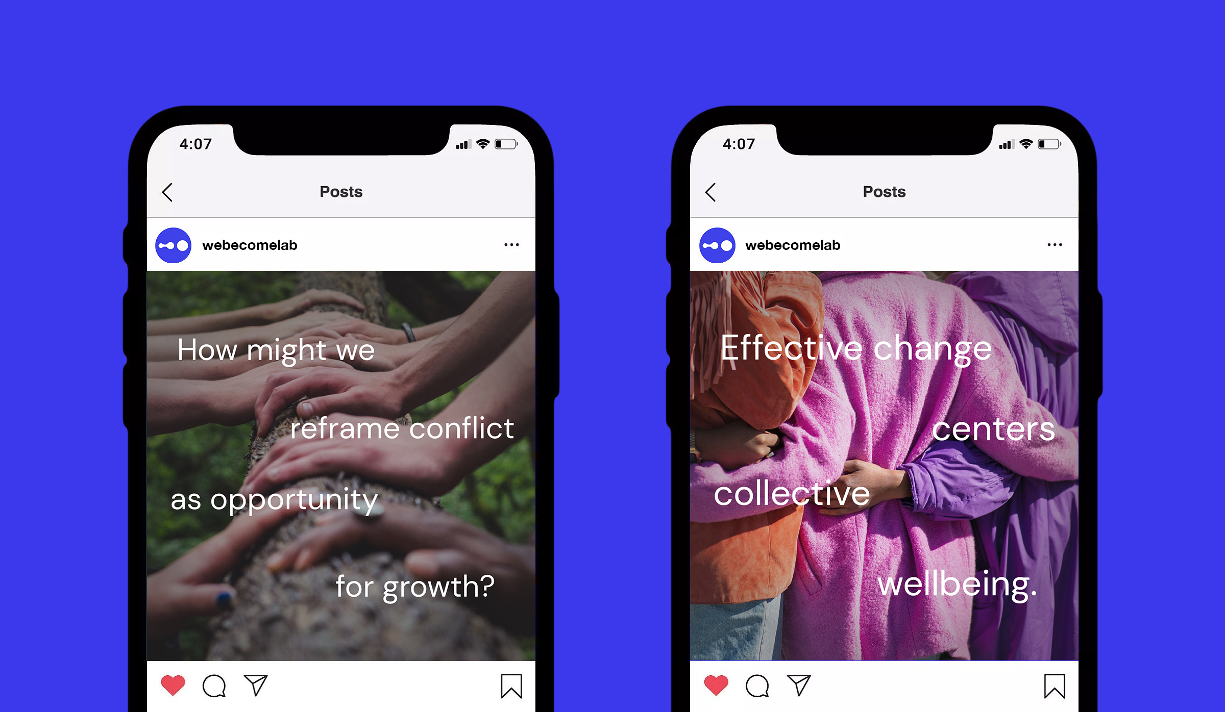
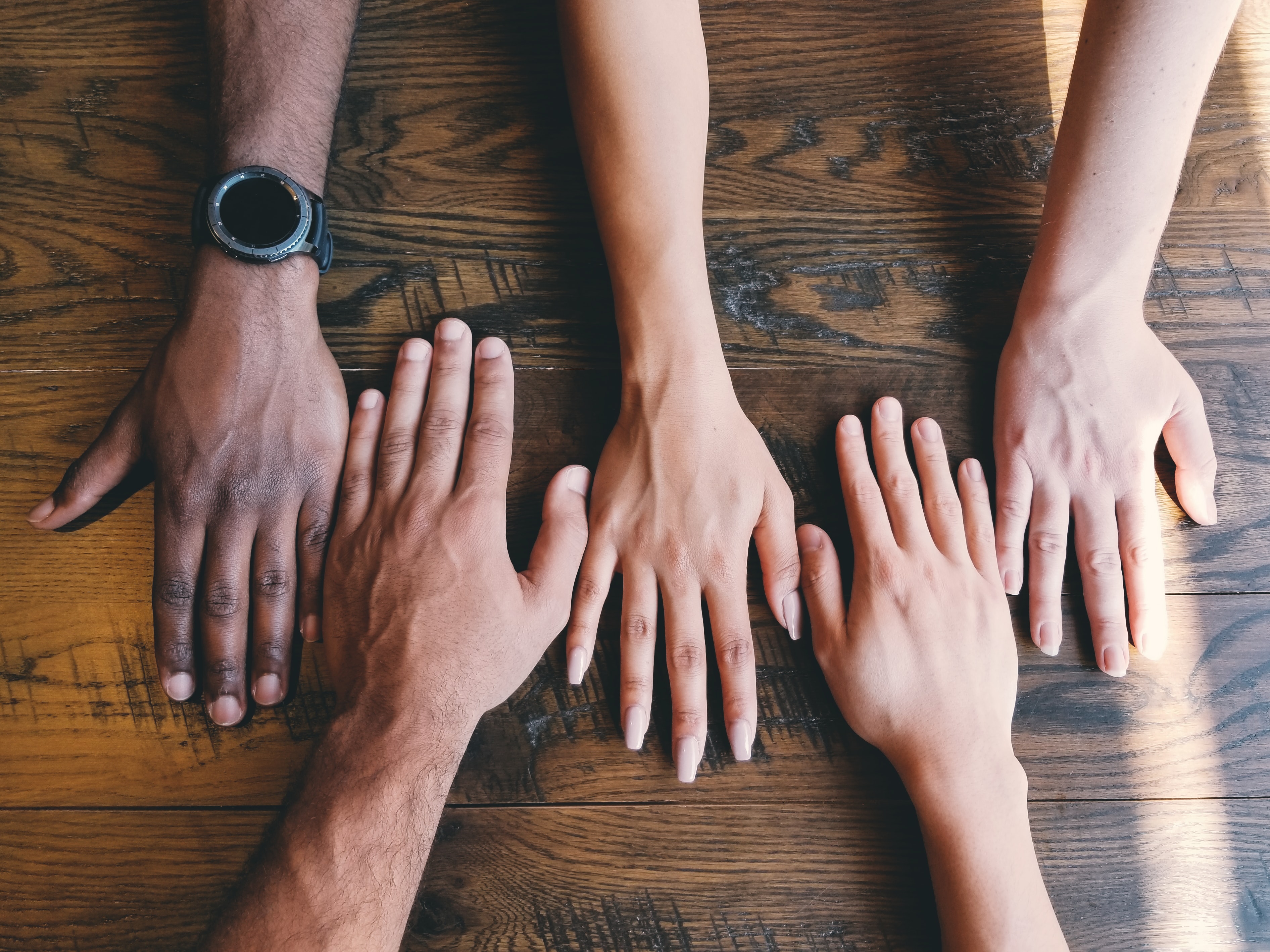
At the core of We Become’s brand is the desire for connection, belonging and collaboration. We showed this through evocative photography using hands and gestures between bodies. Diversity of people matter in our photography because it communicates equity, belonging and accessibility.


To demystify somatic design, we showed our participants actively engaging in the work together–through in person or virtual meetings. We opted for relaxed, casual images of people are best compared to overly posed, forced stock imagery.
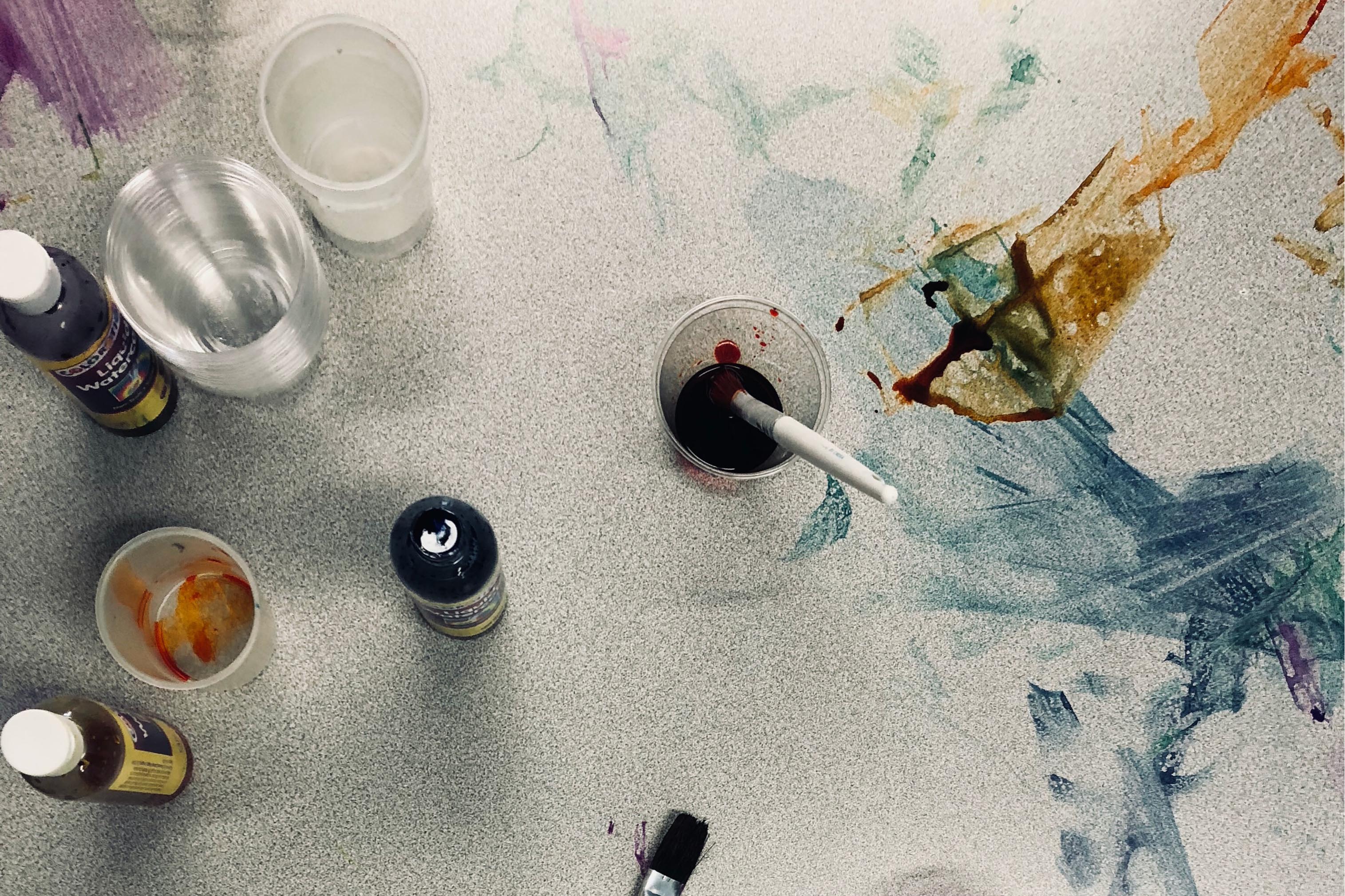
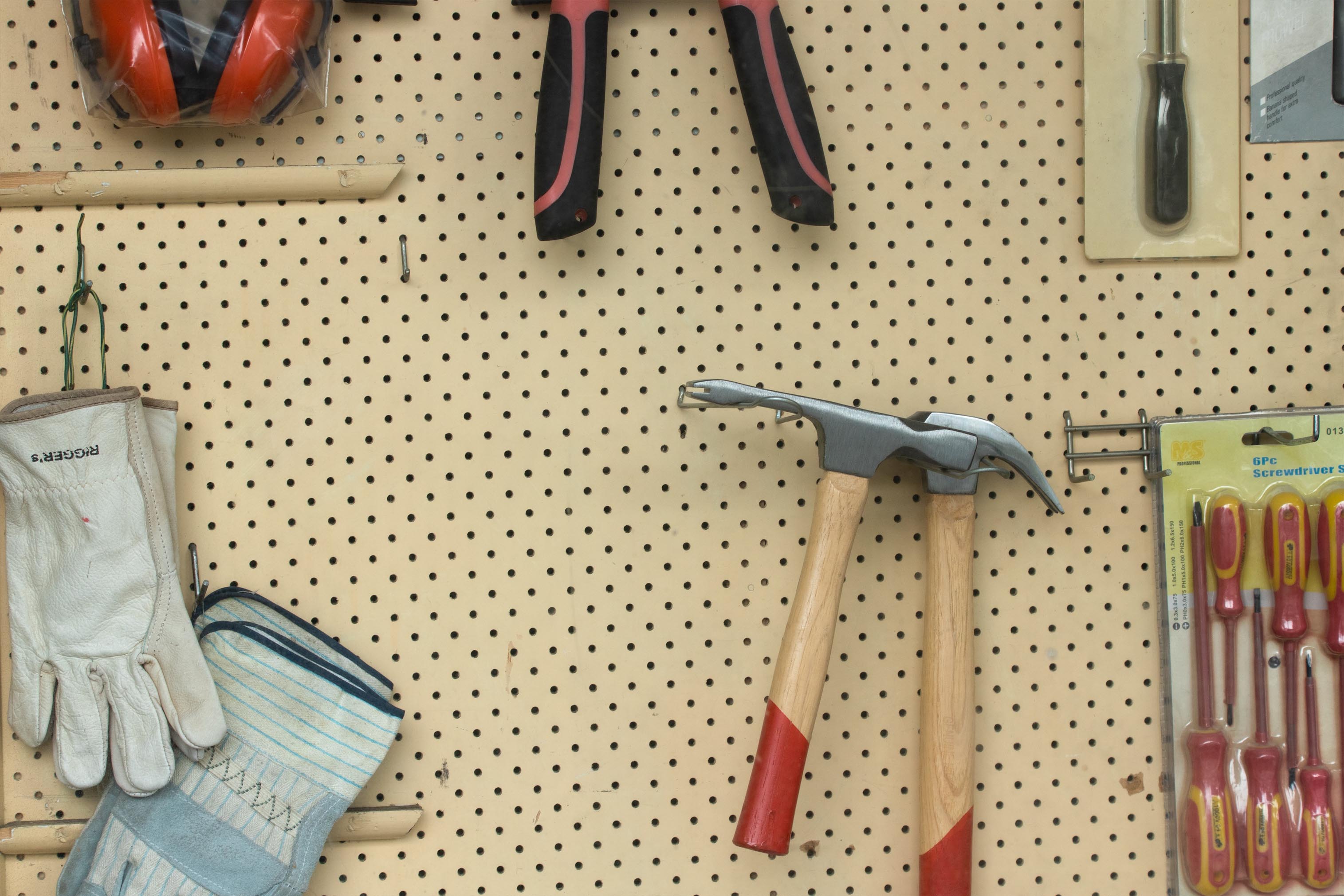
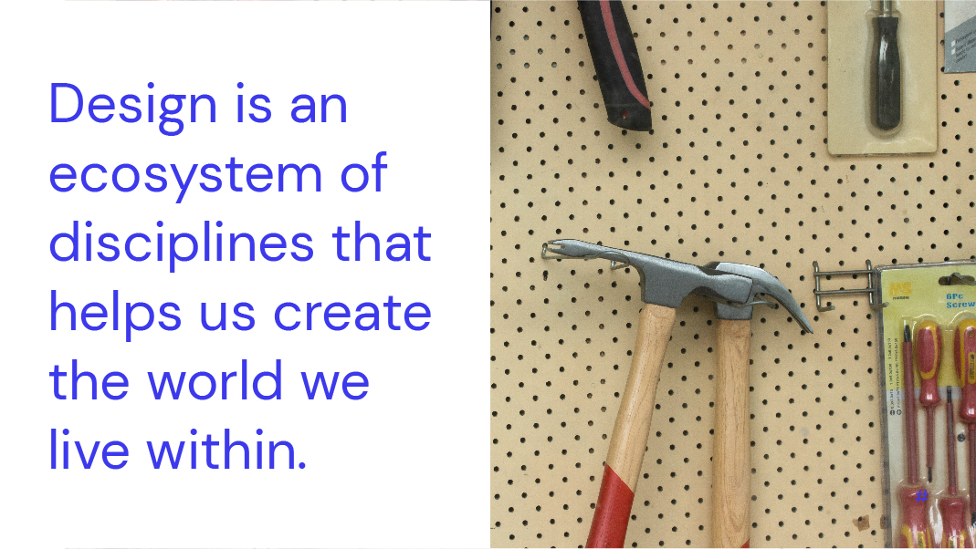
The nature of We Become’s work is often messy, and creative. While the materials we use are often pen, paper and sticky notes, we use imagery like artistic mediums and hardware tools as metaphors to communicate the laborious and inventive process we go through.
Brand Guidelines
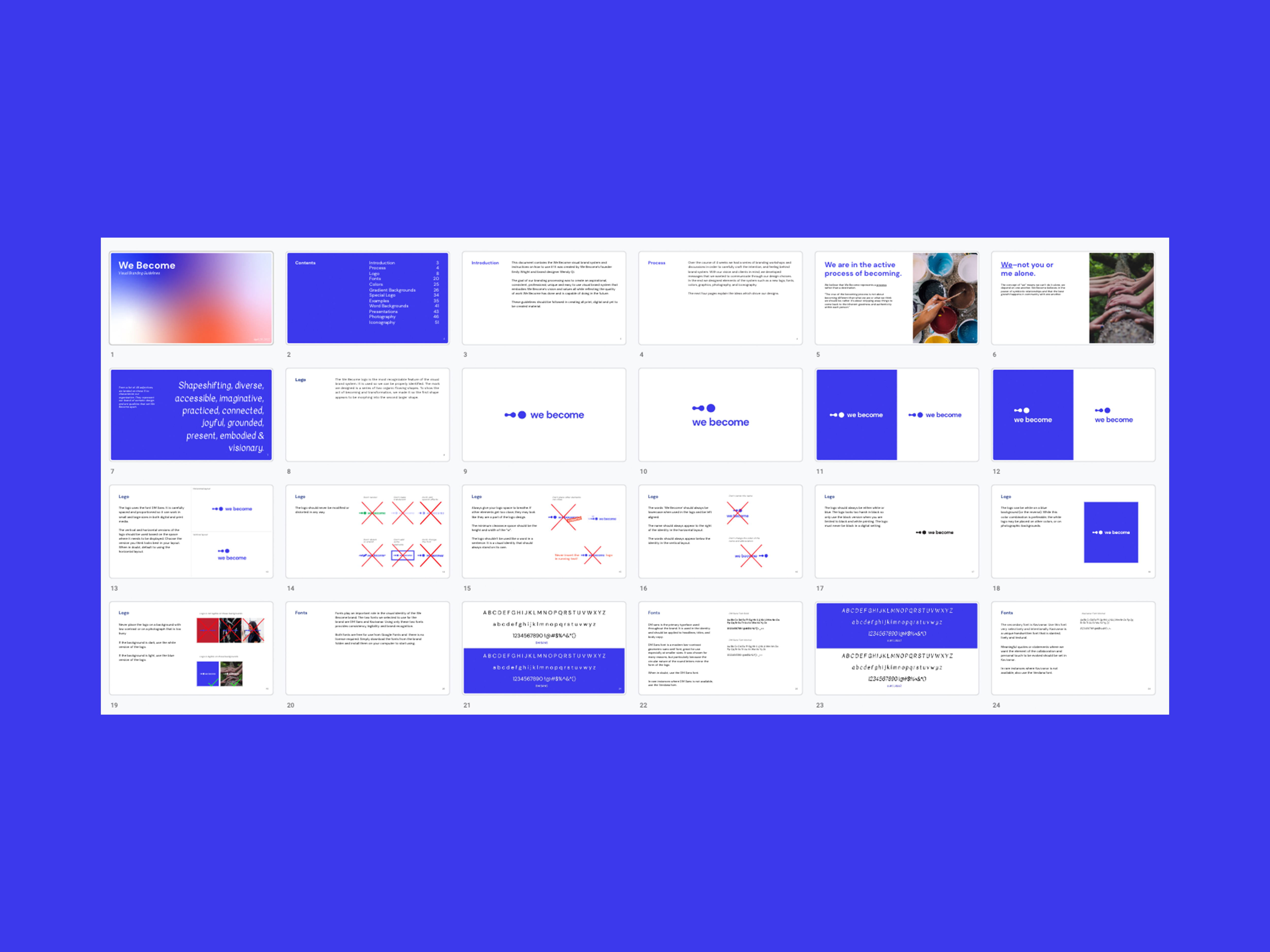
Finally, we made a branding guidelines document with simple, easy to follow design tips to create new We Become branded materials.
“I absolutely love our new logo and identity, and the materials and guidance Wendy provided gives me the confidence I need to apply our style to products and materials. I recommend working with Wendy if you want to build an enduring brand based on a solid foundation of your vision, values, and purpose—and have a lot of fun in the process!”
Em Wright
Founder of We Become
Em Wright
Founder of We Become