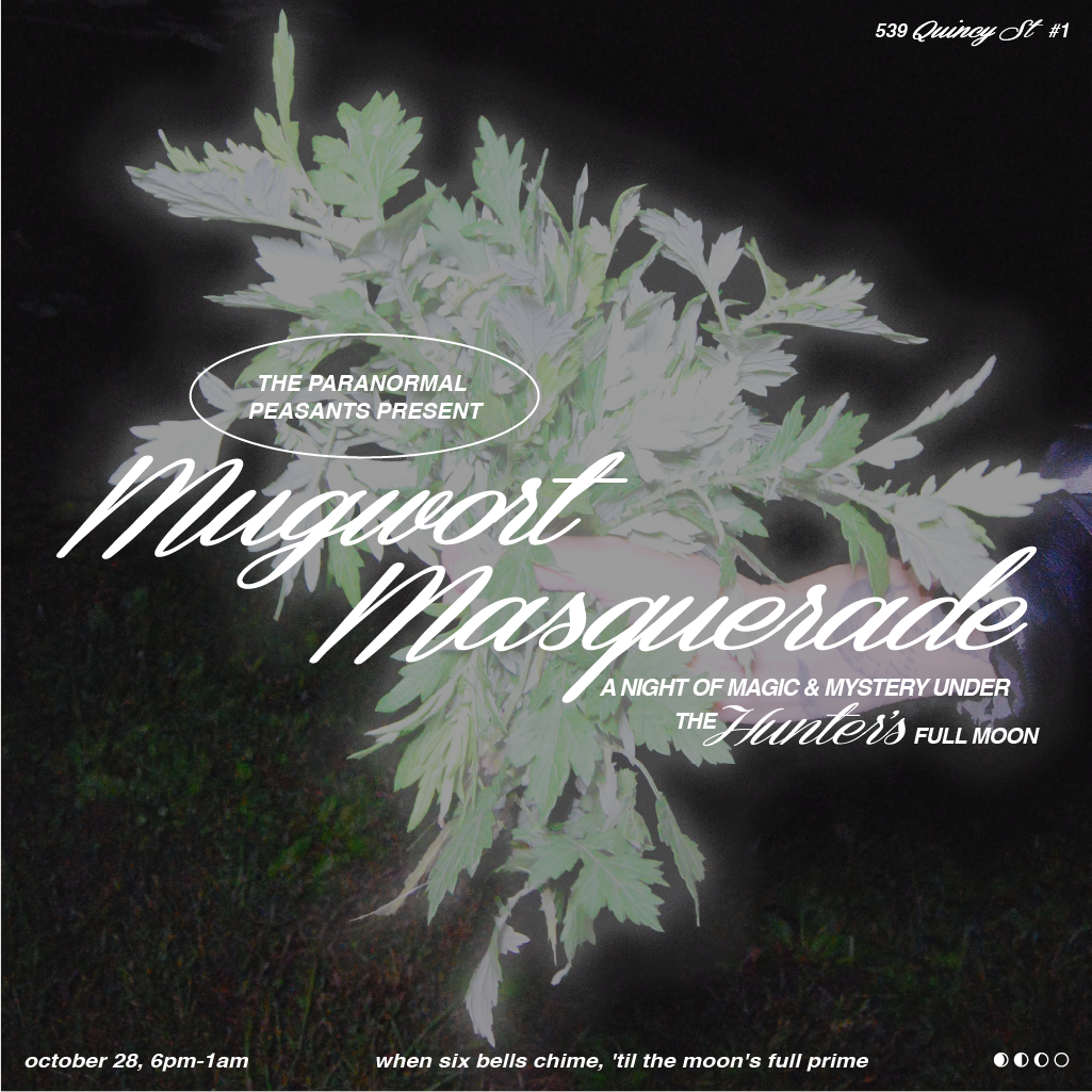
Graphics for Social Media
Services
Graphic Design, Photography


Yesterqueers Branding
Case Study Coming Soon!
Services
Branding, Art direction, Web design, Graphic design
Photography
Huebner Headshots


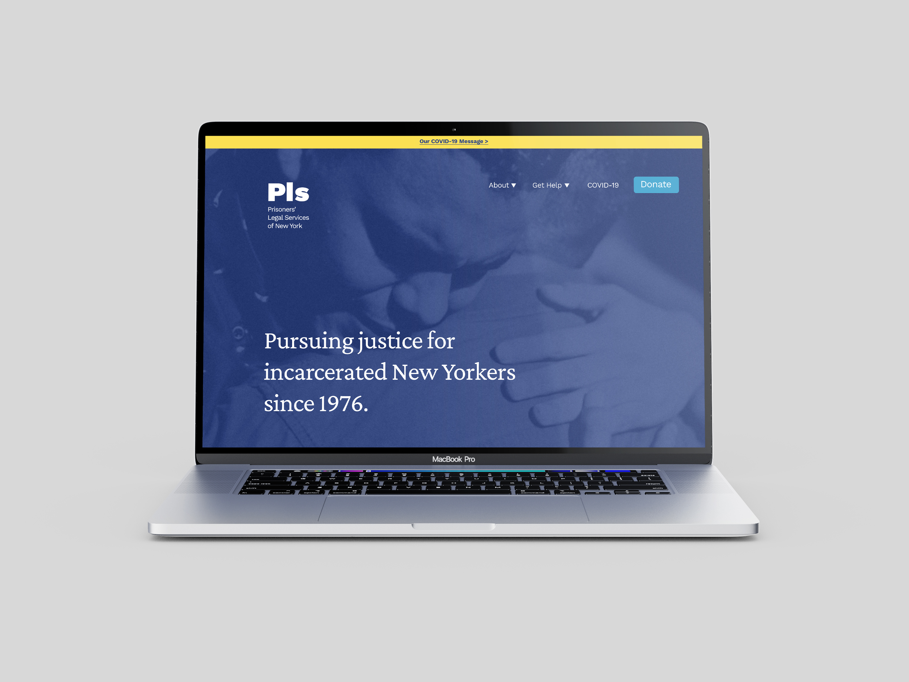
Rebranding an 40+ Year Old Reputable Organization
The Prisoners’ Legal Services rebrand was created to reflect exceptional work that PLS has done–not just for their clients–but for society at large.
Overview
Over the course of 3-4 weeks I conducted a comprehensive discovery phase complete with branding workshops, discussions and an organization survey in order to carefully craft their visual brand system. With their clients, board and NY State in mind we uncovered meaningful messages that we wanted to tell through our design choices. Along the way, we focused in on three powerful traits that PLS embodied: trustworthy, dedicated and experienced. In the end I designed elements of the system such as a new logo, fonts, colors, hand writing, photography, and photographic treatment.
Services
Art Direction, Branding Strategy, Brand Design, Graphic Design

“Wendy was patient, thoughtful, creative and very easy to work with. She was also extremely prepared and timely in any promised deliverables. We are very happy with the final product. If you are looking for someone who will take the time to work with your organization to come up with a unique branding that conveys your purpose and mission, I would highly recommend Wendy!”
Karen Murtagh
Executive Director at Prisoners’ Legal Services
What we uncovered:
1. We bring justice to New York prisons. PLS focuses on the New York State prisons and the incarcerated individuals within them. We bring the courthouse to our clients and focus on addressing the issues they face. We were created out of the Attica uprising because, at that time, no one else was responding to the issues that led to the uprising. A big part of what drives us is to prevent another Attica.
2. Many small actions lead to big change. PLS engages in direct action. The majority of our work focuses on our individual clients. The letters we receive from our clients and the critical issues we work on are the core of who we are as an organization. The result of working on many individual client cases is broad systemic change that benefits all incarcerated New Yorkers.
3. We believe in humanity. We believe that PLS acts as a lighthouse– lighting the way for those that may find themselves in rough waters. We respond to our clients when no one else does, even when our answer is “I’m sorry, we can’t help you.” This is because we believe that they matter–that they count. We believe in their ability to raise themselves up and we try to give them every opportunity we can.

Before & After
Logo
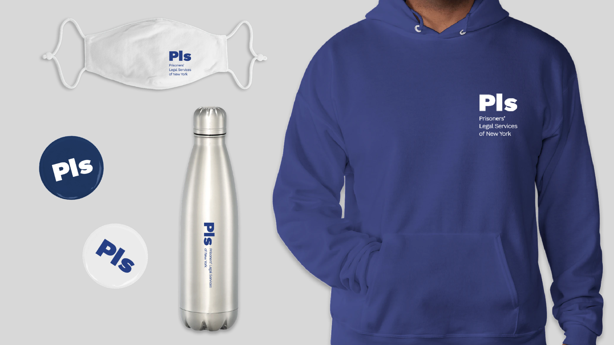
Two major goals of the logo redesign bring PLS into 2021 and make something that was simple and easy to reproduce. The new logo uses the abbreviation ‘Pls’ which is set in sentence case (the first letter is capitalized and the rest are lowercase). The use of sentence case tells the story of the actual letters PLS receives from their clients as nearly all of them written in sentence case.
‘Pls’ also can be read as a shorthand for the word “please”– a polite adverb embedded in correspondence from their clients. Finally, the sentence case design echos the often cordial tone and relationship PLS has with those writing to them.


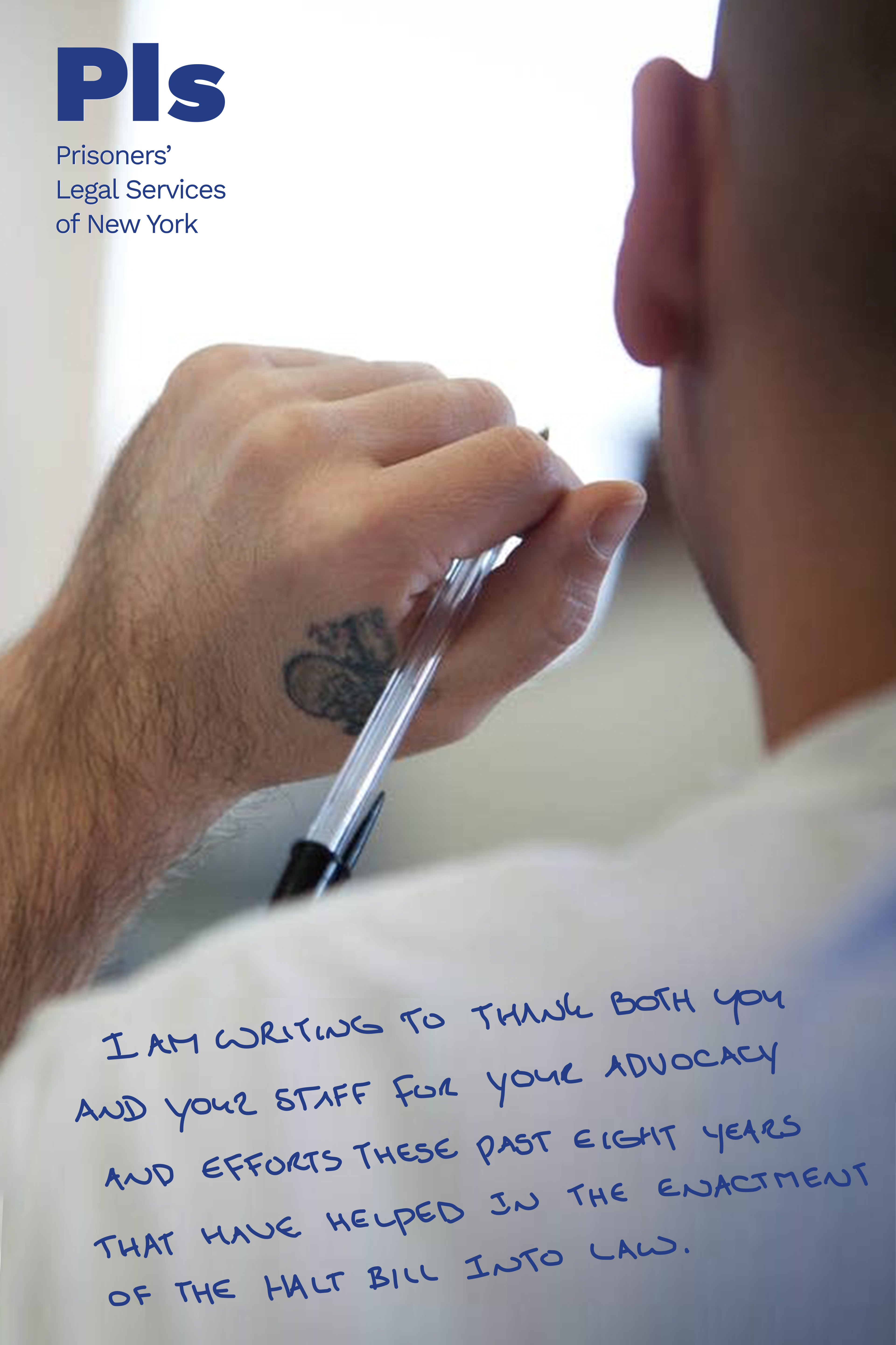
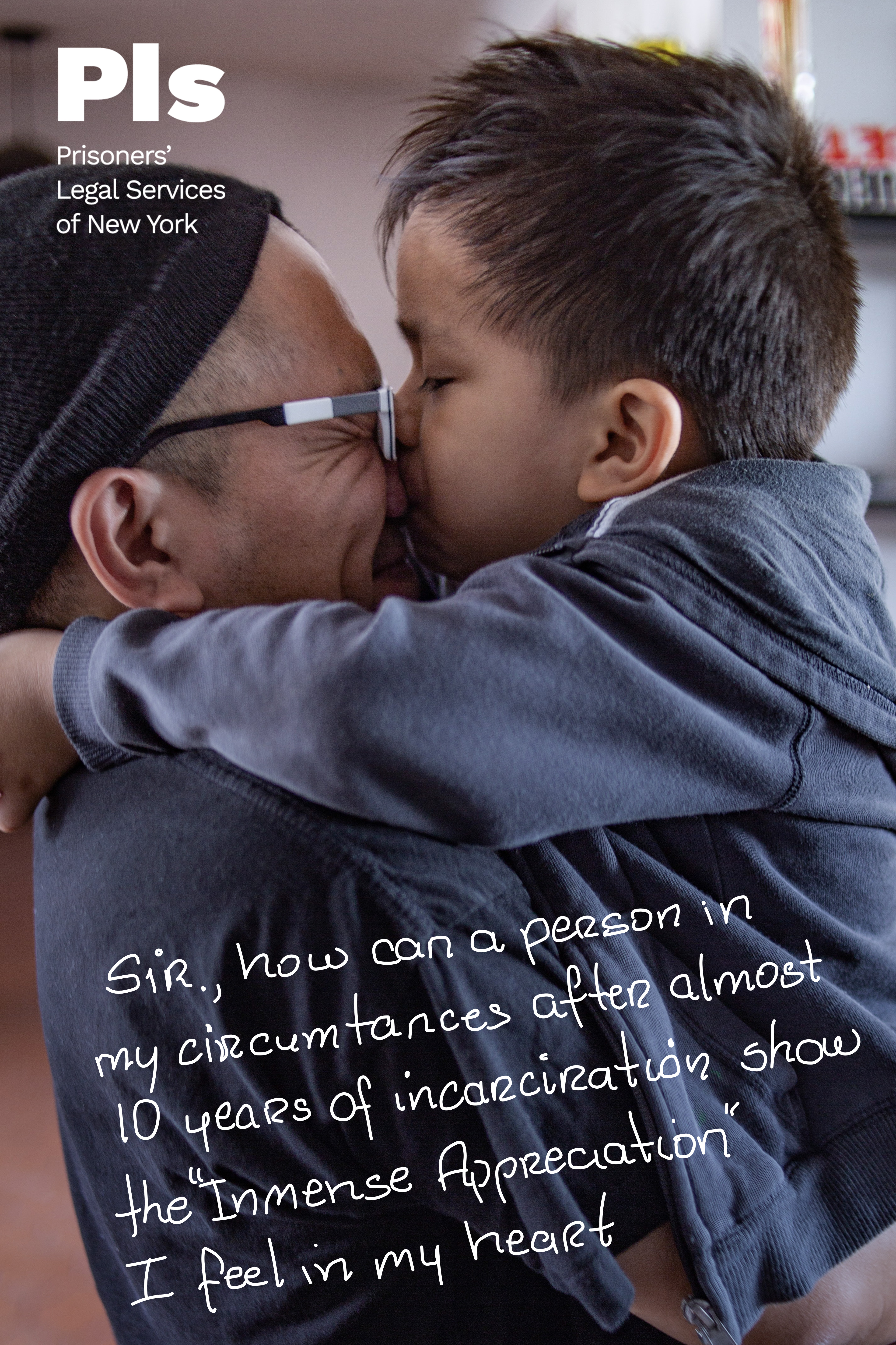
Handwriting
By using traced excerpts from the actual letters PLS receives, we could visually and emotionally communicate the central part of their work. By reading the words and seeing the handwriting of PLS’ clients, audiences get a direct window into the human side of incarceration. We chose to include this because it shares one of our most important values: we believe in humanity.


Color
Every design decision was made with great care and color was no exception. We selected the colors white and navy as the primary pallete. We chose white because it references the courthouses and thus the idea of justice. Additionally white, along with yellow, symbolizes PLS being the light/lighthouse that shows the way while the navy blue represents the ocean. The light blue represents the sky and the idea of looking up while teal is energetic and represents positivity.


Photography
The tone of PLS imagery is clean, optimistic and hopeful. We opted for bright, uplifting imagery over somber, dark imagery of law libraries, courthouses or prisons. In images of the courthouse, we chose images that direct the eye upwards especially if there is a blue sky visible. When it came to showing people, we used deeply compassionate and inspiring images instead of indifferent, depressing or hopeless ones.
The tone of PLS imagery is clean, optimistic and hopeful. We opted for bright, uplifting imagery over somber, dark imagery of law libraries, courthouses or prisons. In images of the courthouse, we chose images that direct the eye upwards especially if there is a blue sky visible. When it came to showing people, we used deeply compassionate and inspiring images instead of indifferent, depressing or hopeless ones.
Bridging the Gap
Case Study
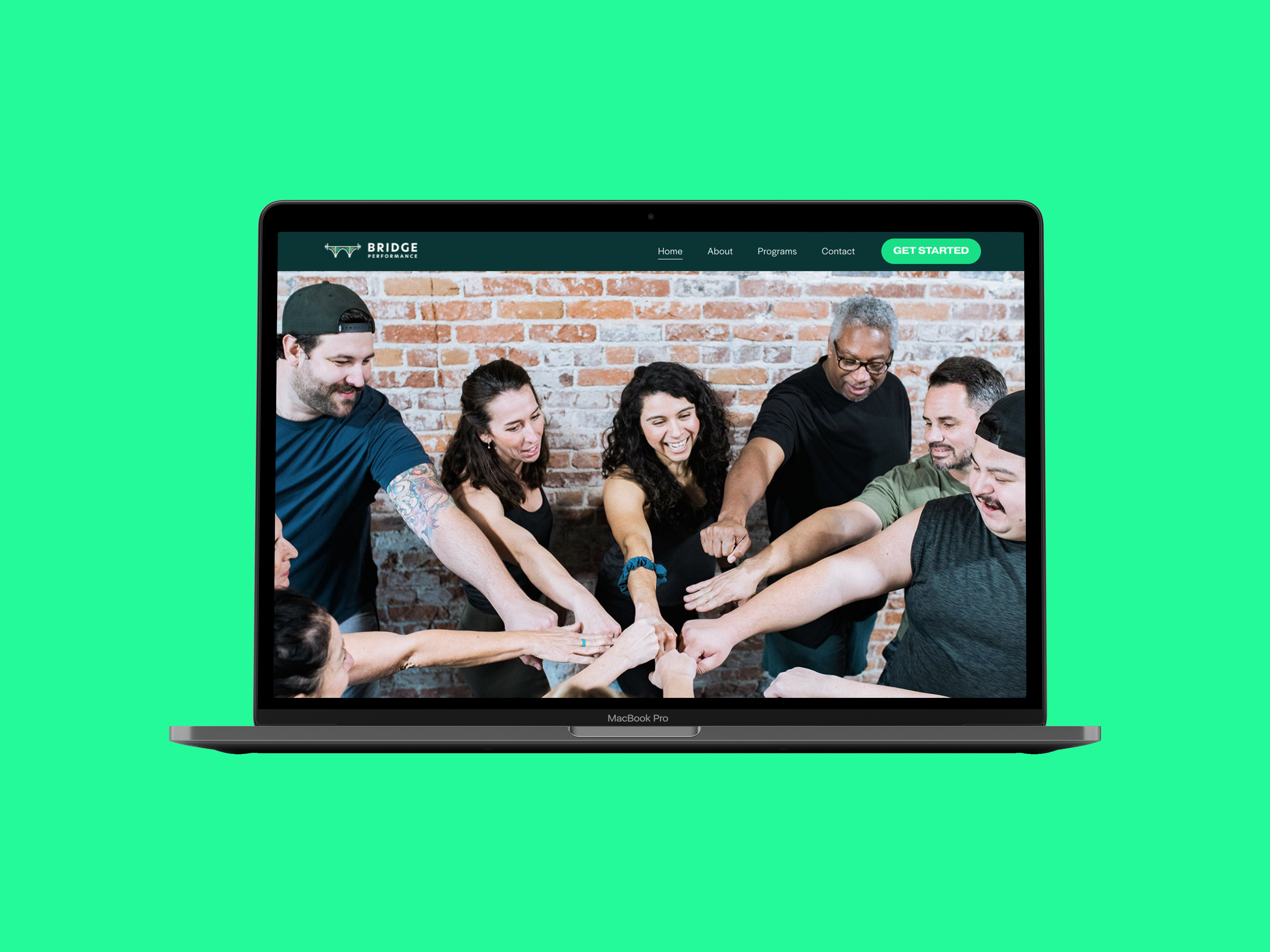
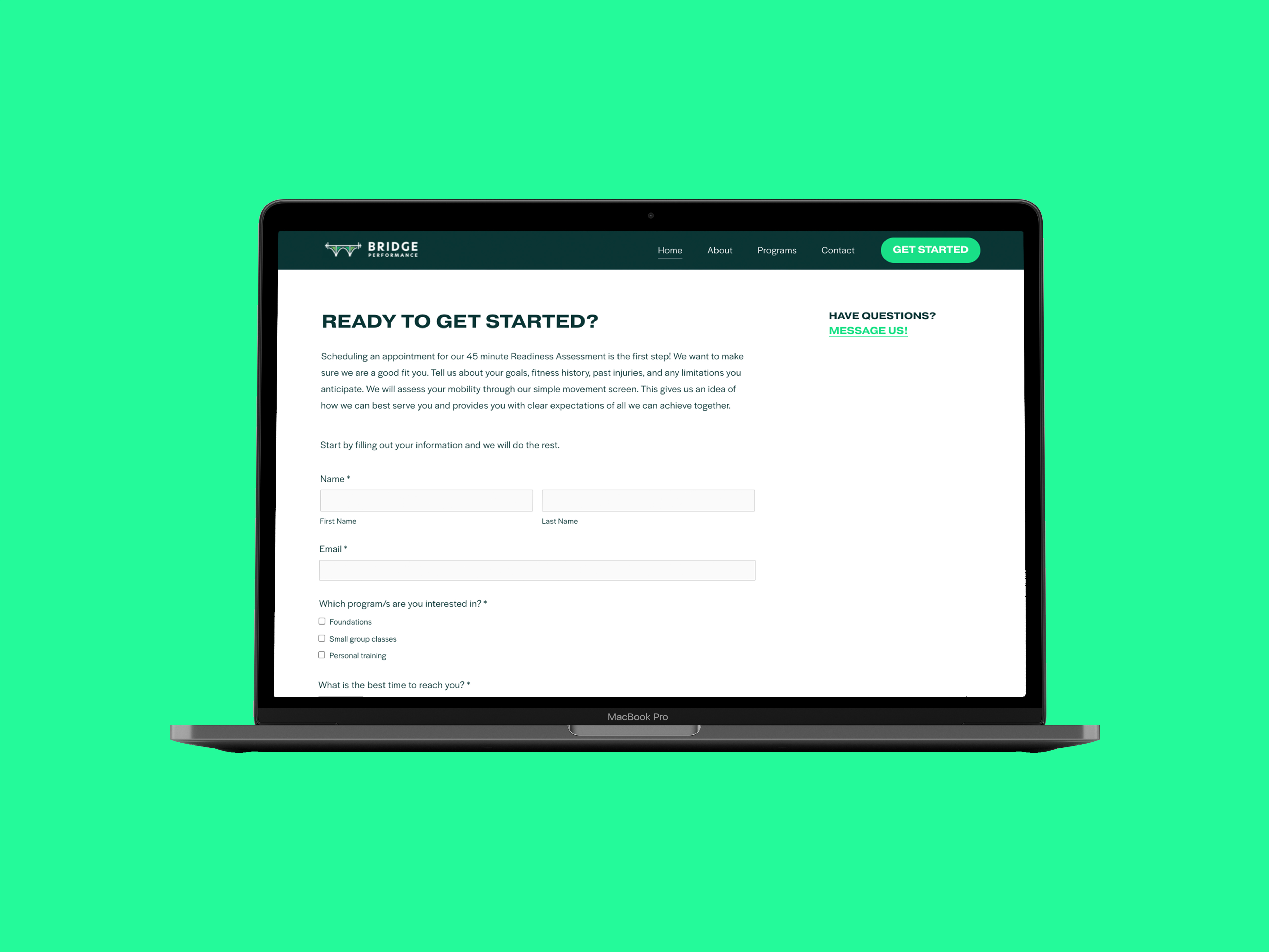
Co-founders Amy and Astrid and I worked together on a website to mark the launch of their first fitness and wellness gym. The website introduces their unique combination of community, strength training and physical therapy while making it easier for anyone—at any age or level—to join.
We wanted the website to not only to establish a virtual homebase, but to convey their expertise and generate new leads thus taking some work off of their extremely full plates. In the early days while Amy and Astrid spent their days securing their gym’s new address, I started the process. We aimed to make a website that would be at once beautiful, easy to use, and future proof.
Website
(We updated it in 2023)
Services
Brand Strategy, Art Direction, UX/UI, Web Design, Graphic Design
Photographer
Brianna Marico

“We had spent hours trying on Squarespace experimenting and found ourselves frustrated and overwhelmed by how many options there were. We had done branding exercises, but had no idea of how to communicate these things in a cohesive way that said who we were and what we offered.
That's when Wendy saved the day.”
Astrid Casteneda
Co-Founder of Bridge Performance

In The Beginning
Before any designing began, I reviewed their branding and facilitated conversations where we took a deep dive on their mission, vision and approach to training while paying special attention to what qualities make them unique.
One of those qualities was the way that Amy and Astrid strive to make an inclusive business where their clients feel seen and cared for. They founded their gym because they saw a common issue in the fitness industry where coaching and workouts often force people to conform to unrealistic and unsustainable standards that lead most people to burn out or give up. They had a different approach to completely change that.
Bridge Performance uses a community based and holistic approach to training and they prioritize their relationships with their clients. They take the care and time to learn about their clients and explain things. If someone wants to lose weight, they don't want to just give them a diet and workout, but instead try and change their relationship with food. If someone struggles with accountability, social group classes are there to encourage, motivate and support them. If someone is experiencing pain, they don’t make them opt out of movement, but give them tailored exercises they can do to get out of pain.
In Amy’s words:
“It’s in the way we coach, communicate, educate, we don't want to just send you away sweaty, we want to make sure we are pushing you towards wellness autonomy.”

Learning more about our audience
Just as Amy and Astrid cater to the unique needs of their clients, the website was designed to address the specific needs of its visitors. The main mission of the website is to attract new clients. This started with identifying exactly who their audience is and what they look for in a gym.
I started by conducting a workshop to create personas (fictional representations based on different types of clients) to understand their audiences' different needs. Amy and Astrid already had a group of very dedicated clients, majority of which identified as female. These individuals were ready to join Bridge Performance, so we created one persona to represent them, another for semi-regular clients and a final persona for new potential clients. The potential clients would ideally include everyone, but to get specific, we developed this third persona to represent people over 50 years old who have heard of BP through word of mouth and were interested in learning more. Through the workshop, we discovered that they view fitness as anti-aging and are very keen to have a workout routine. They have a fitness mentality that “an object in motion stays in motion and an object at rest stays at rest”. However, the overwhelming majority of this group find weightlifting very intimidating and want to feel comfort, safety and very personalized instruction.
The goals for the website really took shape after the workshop and we made it an objective to be inclusive of older individuals especially because much of the fitness industry either overlooks or completely erases them. We believe that when you see yourself represented, you feel seen and welcomed so we gathered authentic testimonials from clients over 50 and used inclusive language and photography.
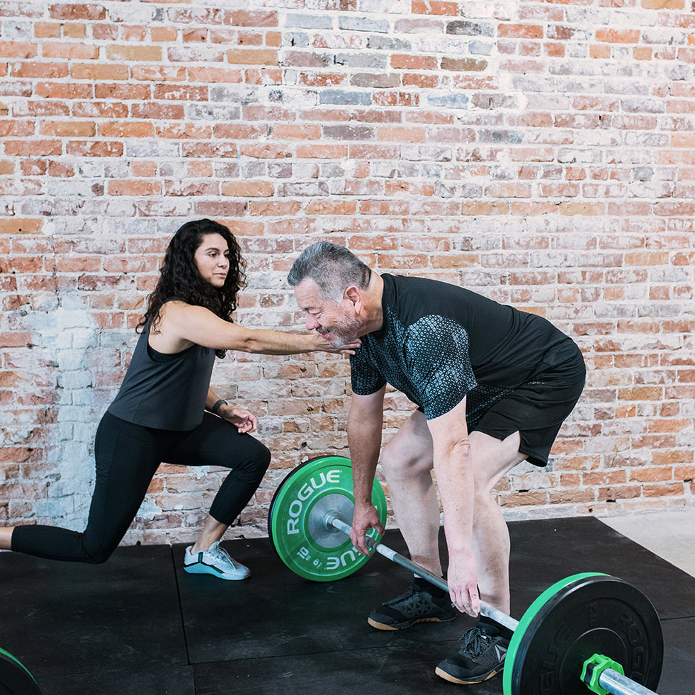
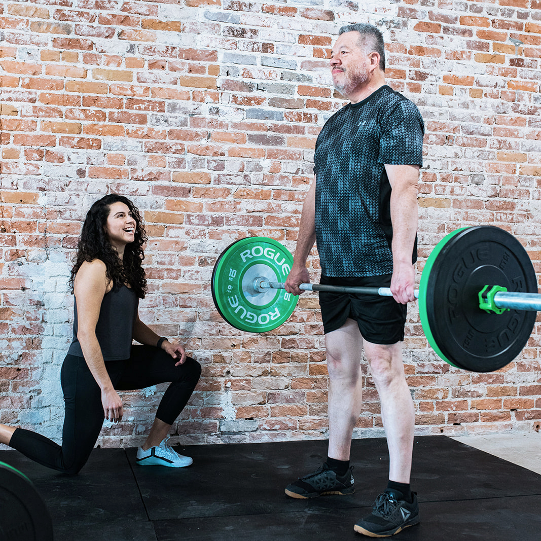
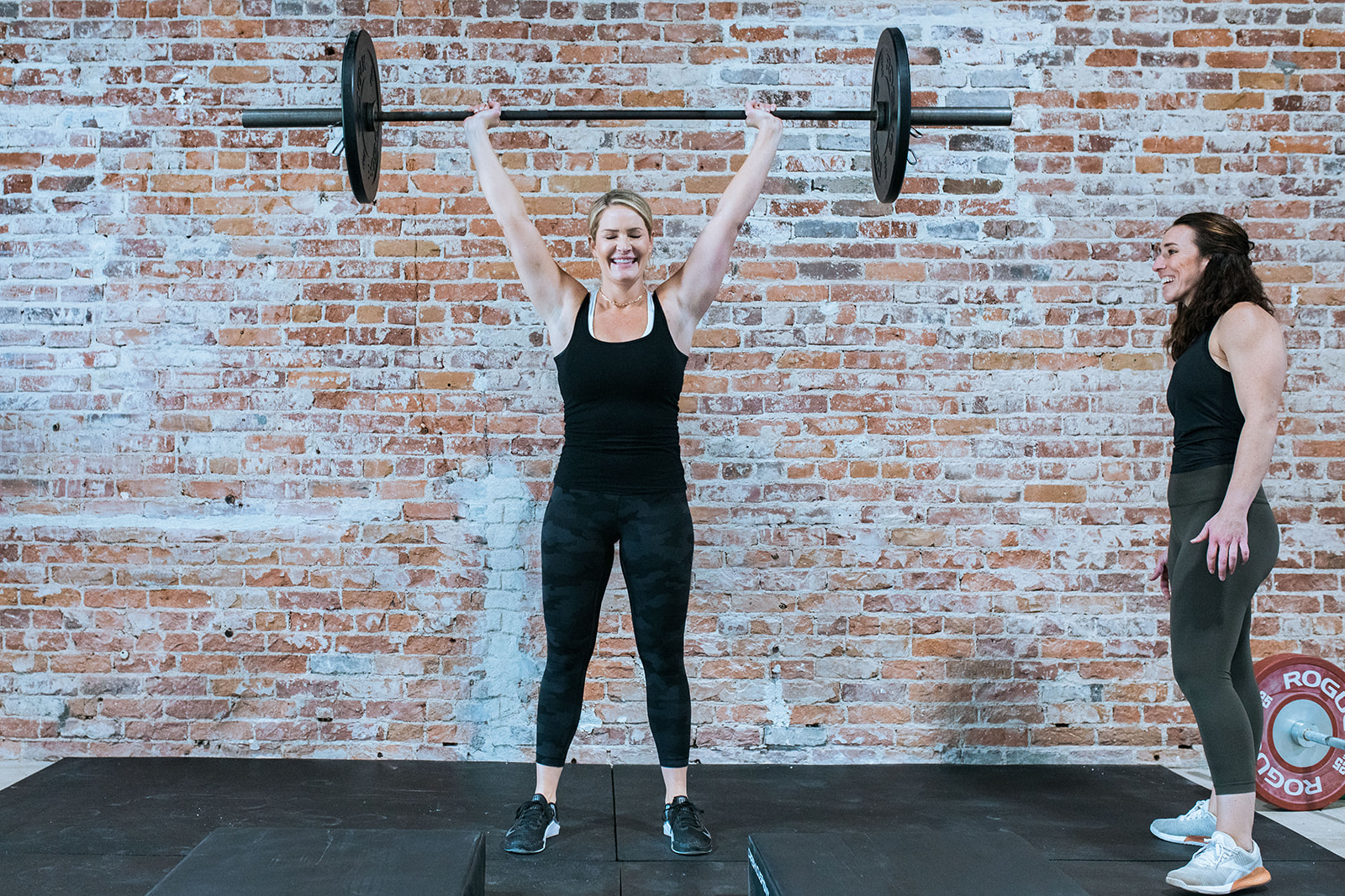
We showcased their client Shelly–a 72 year old woman who had two total knee replacements–and used her image and testimonial on the homepage. We set up a photoshoot where we used Amy and Astrid’s real clients who spanned all ages and backgrounds. We featured older clients working out in group classes amongst younger clients and participating in all aspects of the gym culture.

“Wendy took the time to get to know us, our business and where we wanted the business to go.”
Astrid Casteneda
Co-Founder of Bridge Performance
Positioning
Bridge Performance’s existing branding had attributes like fresh, strong, energetic and vibrant. While we kept to those adjectives, we wanted to position the brand as warm, inclusive and welcoming.
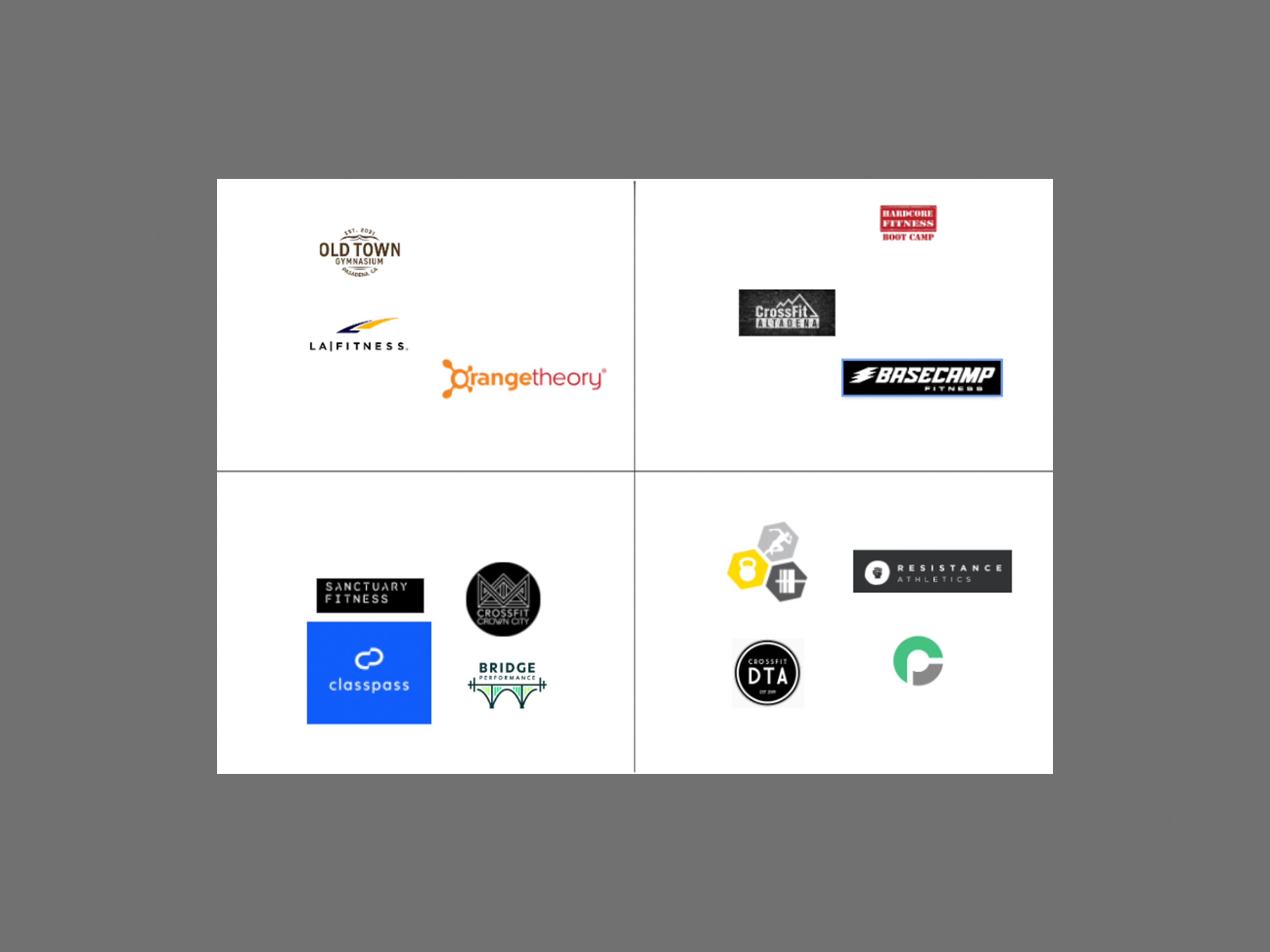
After a quick market analysis of 12 national and local fitness gyms, we conducted a positioning workshop to understand how Bridge Performance could stand out in the market. We found that on the national level we were strongly aligned with a brand like Classpass whose website felt modern, friendly and easy to use, while we opposed brands like LA Fitness which felt dated, uninspiring and conventional. On a local level, we were felt closest to Crowncity Crossfit and Sancuary Fitness and furthest from Hardcore Fitness Pasadena. We gravitated towards Crowncity Crossfit’s messaging and photography which felt uplifting and inclusive. Meanwhile we were polar opposite to Hardcore Fitness Pasadena which felt extremely aggressive, intimidating and intense.

Moodboarding
Next, we took what we learned from the positioning and moved to clarify our approach through moodboarding. We collected visual examples of branding, photography, typography, color and graphics that resonated with the BP brand. These examples served as our Northstar–they inspired us, aligned us and most importantly influenced our website’s look and feel.
Site Structure
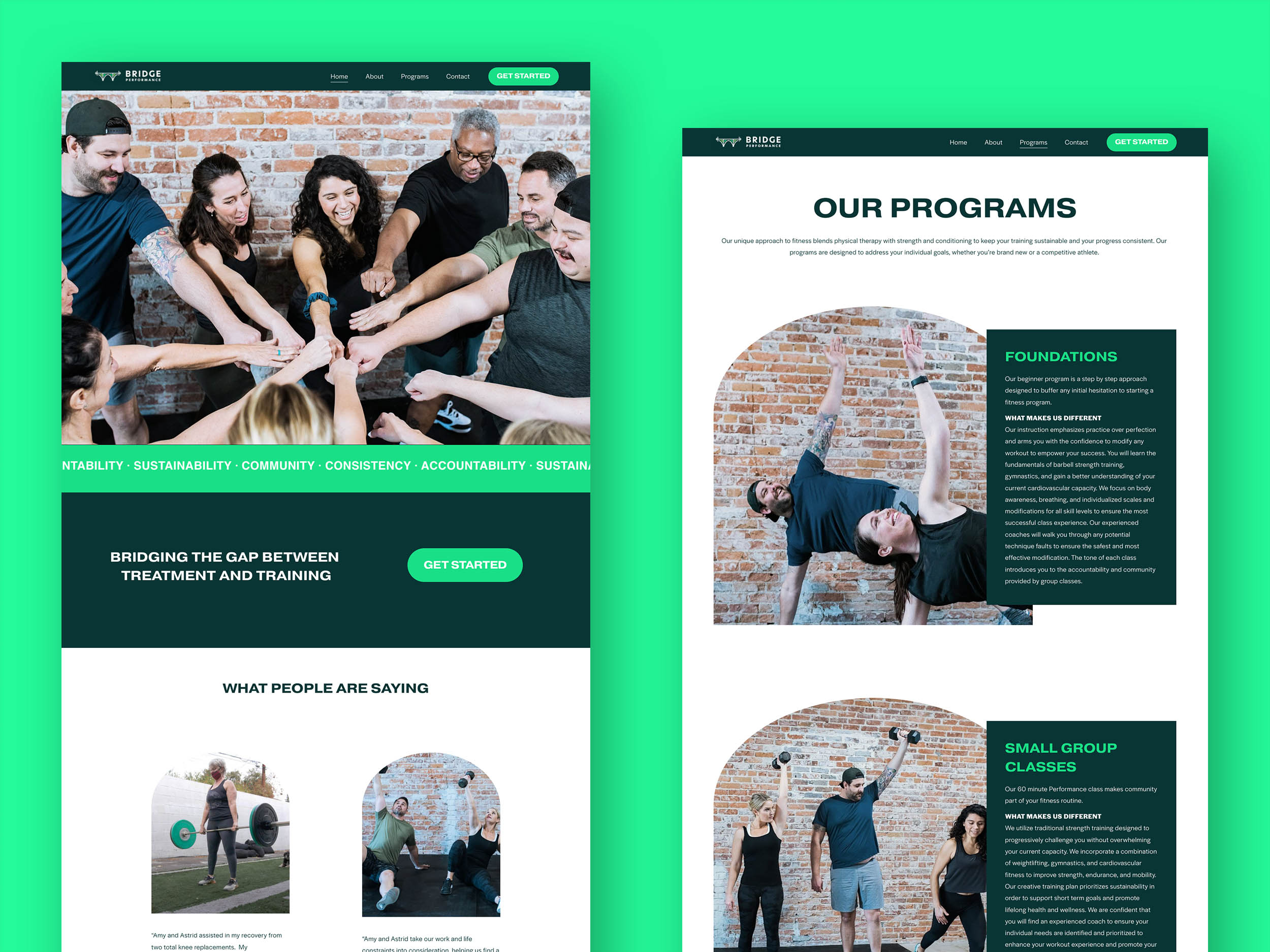
We put our target audience of prospective clients into two groups and tailored the website to suit both of them. Since the majority of the website was designed for newcomers, we placed a “Get Started” button frequently throughout the website. The homepage served as both a landing place and a filter for both audiences to find what they needed. Those who want to dive deep and learn more about Bridge Performance before they make the decision to join, can read about the various programs, the backgrounds of Amy and Astrid and the philosophy of the gym itself. We categorized this group as “divers” because they would likely take the time and read everything. The second group we referred to as “swimmers and skimmers”, these were people that were interested and perhaps had specific information they were looking for, but wouldn’t spend the time to read everything. Because of this group we kept to strict word counts, used large titles and succinct summaries followed by detailed descriptions for efficient browsing.

Design
From their brand colors, we selected the energetic lime green as an accent color to draw attention to titles and links. We paired this with background colors like white and a neutral forest green.
For typography, we went with a large modern bold font for titles and statements. For body copy and details, we contrasted the title font with a friendly, round, wide font. We kept all buttons large so they command attention and feel prominent.

The Bridge
All prospective gym members would likely be local residents of Pasadena, thus it was important to make reference to Colorado Street Bridge–which is featured prominently in the logo and in the story of the Bridge Performance. The bridge not only was a metaphor to bridge training with therapy, but Pasadena locals feel a sense of belonging and ownership after seeing it. For example, after seeing the Bridge Performance logo, they would say things like: “This is my city, this is my gym.” To subtly make reference to the bridge, we used an arched shape to house some of our images.


Photography
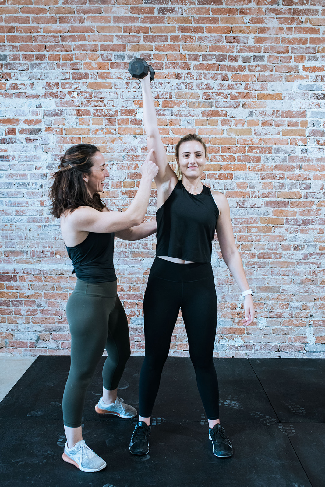
Photography did a lot of the work in communicating Bridge Performance’s brand values, especially those of community and positivity. Working with photographer Brianna Marico, we captured people who represented a diversity of age, body type and race. We focused on capturing people in action, smiling, and interacting with each other. One of our objectives was to make ordinary people look momentous and powerful through the use of perspective, breaking the mold of unrealistic fitness standards.
We focused on getting images of Amy and Astrid working directly with their clients–making hands-on adjustments and encouraging them– thus capturing their coaching abilities and their love for what they do.
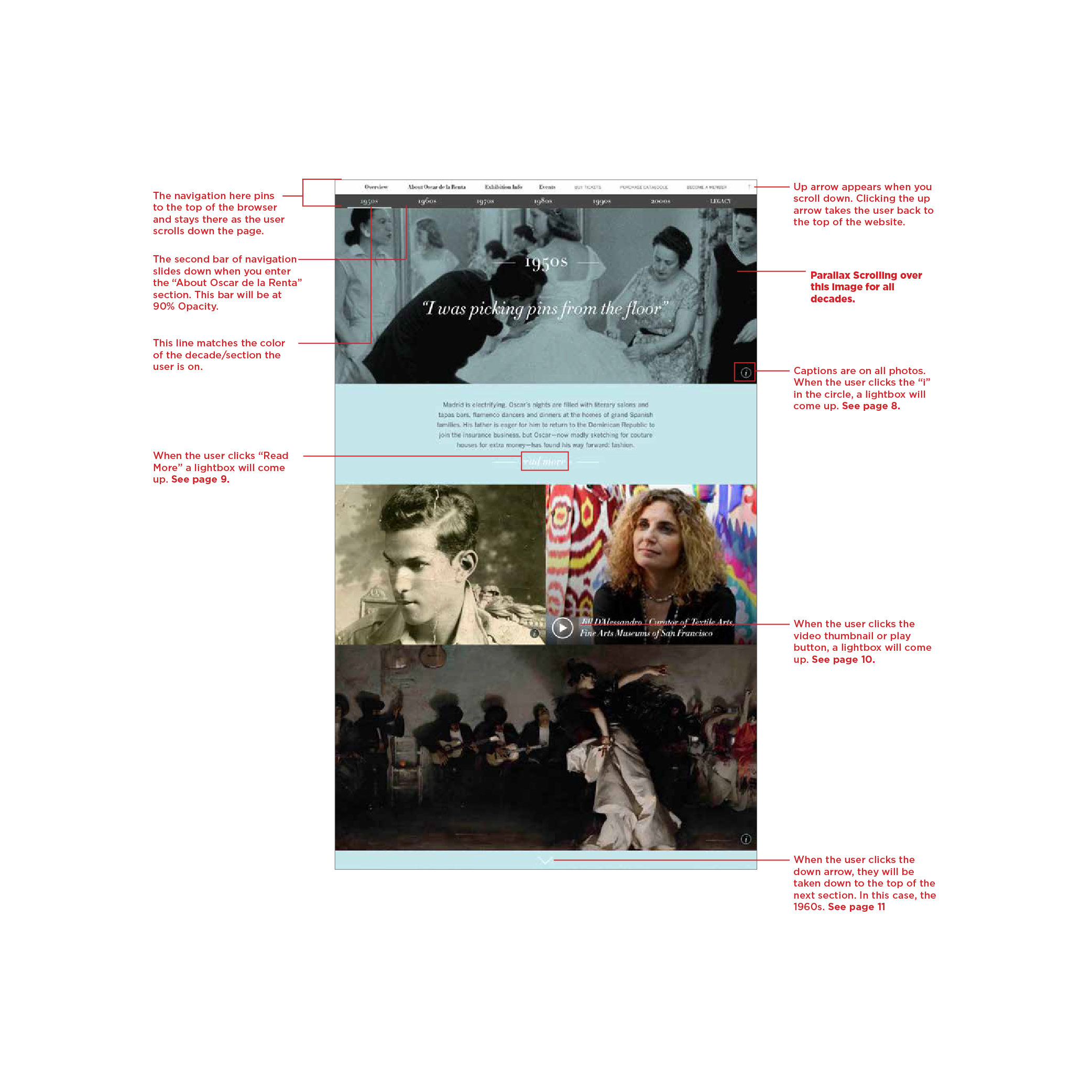
Modern Exhibit for a Timeless Designer
Decade by decade, follow the rise of Oscar’s de la Renta’s career and learn how he became one of the most influential designers of the century. This website features archival images and interviews with the exhibition curator, memories from fashion editor Andre Leon Talley and of course, Oscar de la Renta’s timeless designs. Designed at Double Space, we aimed to create a web experience that captured de la Renta’s optimistic spirit, the beauty of his work and legacy he left behind.
Services
Art Direction, UX/UI, Graphic Design, QA Testing, Production
Agency
Double Space

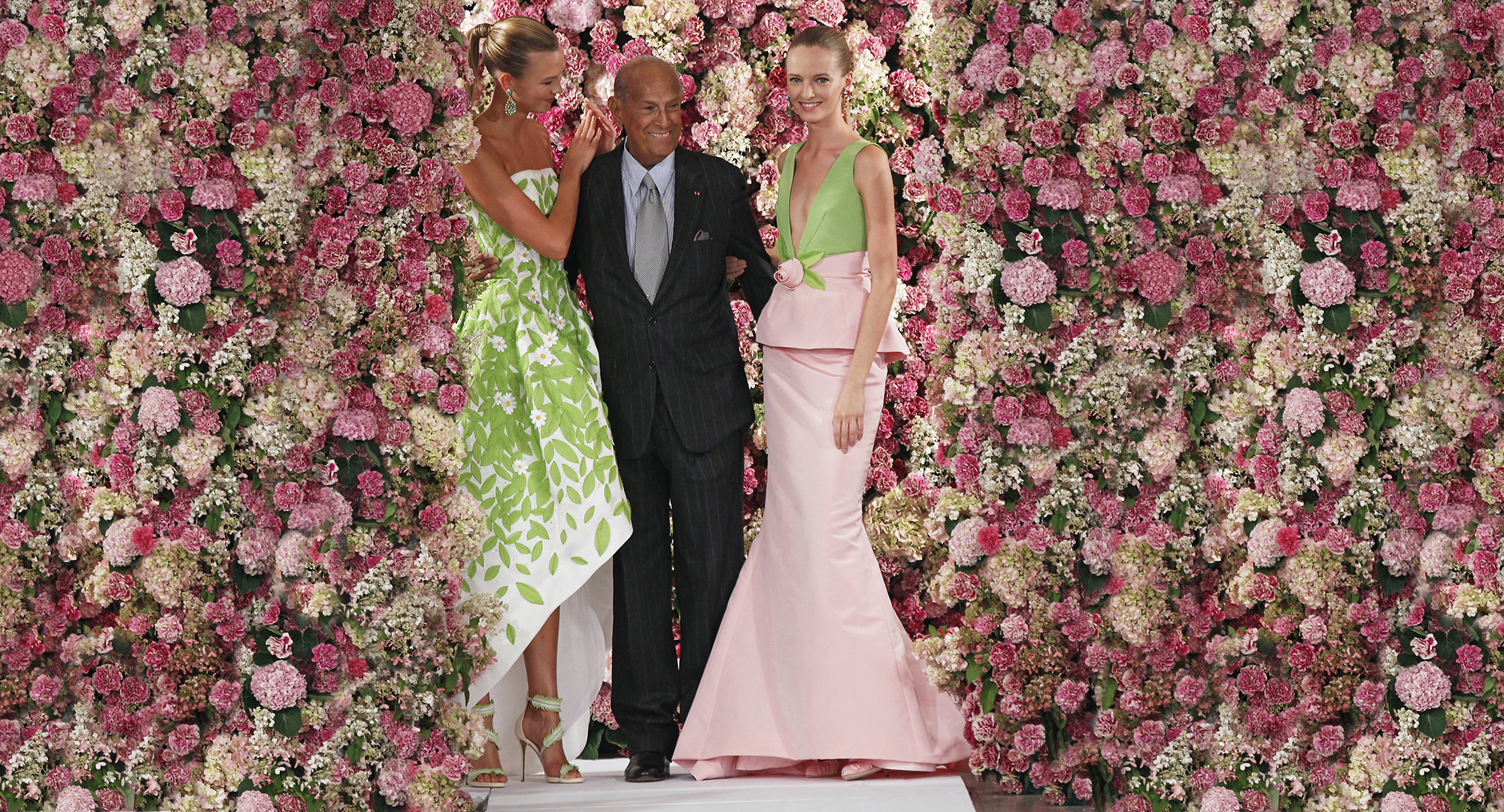


Working with the de Young museum, I worked on the site’s architecture, UX, interface and performed QA testing on the final product. The most exciting part of the project was the art direction. We had access to the images from an incredible photo archive of Oscar de la Renta’s work and life from which to select from. I spent 3 weeks pouring over and pulling images that we used on the final website and campaign.
Development Guidelines
Mobile Navigation & Lightbox
![]()
![]() Desktop Navigation & Decade Pattern
Desktop Navigation & Decade Pattern
![]()
Mobile Navigation & Lightbox


WOW, IT’S WENDY!
waʊ, ɪts ˈwɛndi!︎
:an expression used to express a strong feeling such as pleasure, delight or surprise.
︎ ︎ ︎
Wendy Qi (she/her) is a New York City based freelance designer specializing in branding, websites and events.
Wendy has 13 years of experience working with small businesses and large organizations alike crafting narratives and brand identities. She collaborates closely with clients and provides ongoing design support for agencies.
Get in touch to see how we can work together. Say hello@wowitswendy.com to get started.
︎︎︎ Background
Wendy was one of the first designers at The Public Society: a small group of creatives leveraging the power of design for the greater good. As both a designer and studio manager, she worked to establish the company’s culture and design processes.
Wendy was also an adjunct instructor at Cooper Union where she taught a course on translating 2D collages into web experiences with code.
Throughout the years, her work has been featured in The New York Times, nominated as a finalist for New York Design Awards, shown in Hong Kong Design Centre's deTour exhibition and published in the international magazine TLmag.
Wendy’s side project is naturally dyeing textiles using found objects, food waste, flowers and foraged plants.
︎ Clients by Sector
︎Education & Art
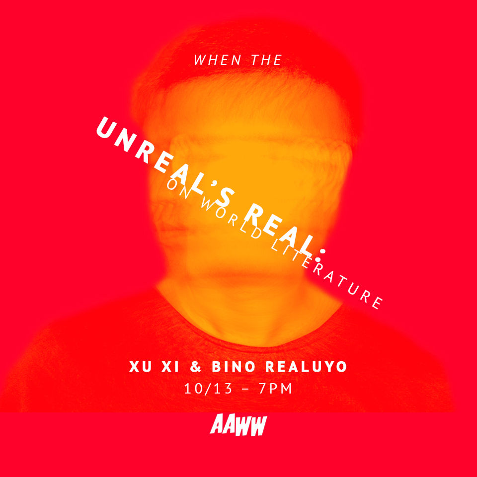
Asian American Writer’s Workshop
The Cooper Union
de Young Museum
New York University Tandon School of Engineering
New York University School of Law Policing Project
Under Consideration’s Brand New Conference
︎Social & Environmental Justice
350.org
The Atlantic Philanthropies Fellowship for Racial Equity
Avaaz
Civic Hall
The Democracy Alliance
Greenpeace
Housing Court Answers
Narrative Initiative
Paul and Daisy Soros Fellowships for New Americans
Prisoners’ Legal Services of New York
United Nations Environmental Programme
Urban Future Lab
Traffic Safety for All
︎Small Business
Amanda W. Timpson
Arezu Persia
Bridge Performance
We Become
Yesterqueers
︎Studios & Agencies
doublespace
HUGE
The Public Society
Spitfire Strategies
︎Corporations
Depop
Google
IMG Models
The Interpublic Group
New York Road Runners
Unilever Brands
United Technologies
︎Education & Art
Asian American Writer’s Workshop
The Cooper Union
de Young Museum
New York University Tandon School of Engineering
New York University School of Law Policing Project
Under Consideration’s Brand New Conference
︎Social & Environmental Justice
350.org
The Atlantic Philanthropies Fellowship for Racial Equity
Avaaz
Civic Hall
The Democracy Alliance
Greenpeace
Housing Court Answers
Narrative Initiative
Paul and Daisy Soros Fellowships for New Americans
Prisoners’ Legal Services of New York
United Nations Environmental Programme
Urban Future Lab
Traffic Safety for All
︎Small Business
Amanda W. Timpson
Arezu Persia
Bridge Performance
We Become
Yesterqueers
︎Studios & Agencies
doublespace
HUGE
The Public Society
Spitfire Strategies
︎Corporations
Depop
IMG Models
The Interpublic Group
New York Road Runners
Unilever Brands
United Technologies

"I can't recommend Wendy Qi enough—we worked together on a major graphic design project this past spring and Wendy's work was beautiful, effective, and easy to use and update. Wendy started the project with research and discovery work to understand the needs and design direction. For example, she audited our organization's past designs, talked with us about what we liked/didn't like, and did a workshop to build brand literacy. She was incredibly thoughtful about designing for our specific audiences and concepted out the storytelling ideas that were important to us. I loved the process and the result. Wendy was easy to work with and very organized as well."
Nikka Landau
Director of Communications @ The Paul and Daisy Sorors Fellowships for New Americans
Nikka Landau
Director of Communications @ The Paul and Daisy Sorors Fellowships for New Americans

“I am so grateful to have had the opportunity to collaborate with Wendy on our rebranding. The whole process was fun, creative, easeful, and accessible. She made accommodations to fit my needs and made me feel like we were truly partnering together to co-create our new brand, rather than being in a more transactional consultant-client relationship. Our initial conversations and workshops in particular were incredibly illuminating—the questions and activities helped surface information and ideas that may not have come up otherwise, which set us on a somewhat unexpected course toward exactly where we needed to go for the final design. I absolutely love our new logo and identity, and the materials and guidance Wendy provided gives me the confidence I need to apply our style to products and materials. I recommend working with Wendy if you want to build an enduring brand based on a solid foundation of your vision, values, and purpose—and have a lot of fun in the process!”
Em Wright
Founder @ We Become
Em Wright
Founder @ We Become

"We were about to launch a service based business and didnt have a website. We had spent hours trying on Squarespace experimenting with layout, content, images, font and found ourselves frustrated and overwhelmed by how many options there were. We had done branding exercises, but had no idea of how to communicate these things in a cohesive way that said who we were and what we offered. That's when Wendy saved the day. She took the time to get to know us, our business and where we wanted the business to go. She worked patiently with us until we were satisfied with a website that not only met our picky expectations of aesthetic and flow but really captured who we were. She was accommodating to our timeline and flexible with the tasks she charged us with. Her professional yet personable expertise made us feel confident in her abilities. In the end she gave us exactly what we asked for, a website that was not only beautiful and clean but easy to navigate, and user friendly."
Astrid Castaneda
Founder @ Bridge Performance
Astrid Castaneda
Founder @ Bridge Performance

“Wendy was referred to us by Spitfire. We were looking to adopt a standardized visual brand that would convey to others our mission, our vision... who we are. Wendy worked with us for approximately two months–scheduling weekly meetings where we spent time delving into our history, identifying stakeholders and defining the qualities that sets PLS apart from other non-profit civil legal services organizations. Wendy educated us on the need and purpose of a standardized visual brand and helped us adopt a new logo, fonts and a color scheme that communicate through digital, print and yet to be created materials, who we are and what we do. Wendy was patient, thoughtful, creative and very easy to work with. She was also extremely prepared and timely in any promised deliverables. We are very happy with the final product. If you are looking for someone who will take the time to work with your organization to come up with a unique branding that conveys your purpose and mission, I would highly recommend Wendy!”
Karen Murtagh
Executive Director @ Prisoners’ Legal Services
Karen Murtagh
Executive Director @ Prisoners’ Legal Services

“I cannot recommend Wendy enough as a website designer! She worked closely with me and my business partners to create something that felt like our vision with her expertise. She knew the right moments of when to accommodate what we wanted and when to push for an alternate approach. What emerged was something that still felt like it was ours, just... better.
Most importantly, Wendy went above and beyond in terms of making sure everything was both looking and working perfectly in the final result. Mistakes I never would have caught, or bits of code that weren't perfect–Wendy kept checking and refining even after I had what I thought was a great result. She definitely holds her work to the highest standard!”
Gary Benton
Partner @ Arezu Persia

“Wendy did a fantastic job developing my brand and redesigning my site. From research to process and execution, Wendy did a fantastic job visualizing my brand in a unique way while staying true to its core identity. On a personal level, she was a joy to work with–thoughtful, organized, and reliable. I highly recommend her and can't wait to work with her again!”
Itzett Romero
Founder of A Modern Meditator & Director of Digital Marketing @ Babbel
Itzett Romero
Founder of A Modern Meditator & Director of Digital Marketing @ Babbel

“Wendy supported Civic Hall on various graphic design projects. Not only did Wendy help us create thoughtfully designed, visually beautiful, and on-brand pieces, she did so while maintaining exceptional organization and project management, clear communication, and thoughtful curiosity to better understand our need. I very much enjoyed working with Wendy and would highly recommend her for any individual or organization in need of brand, design, and/or user experience support!”
Fiona Teng
Strategic Communications Lead @ Beloved Economies
Fiona Teng
Strategic Communications Lead @ Beloved Economies

“Wendy is a fantastic designer, seamlessly balancing her own creative ideas with the (sometimes finicky) needs of her client. I collaborated closely with Wendy a number of visual design projects for the Narrative Initiative, including establishing the visual identity of the brand new organization itself. Receptive to feedback and joy to work with. I hope we can work together in the future!”
Nima Shirazi
Vice President @ Spitfire
Nima Shirazi
Vice President @ Spitfire