Rebranding an 40+ Year Old Reputable Organization
The Prisoners’ Legal Services rebrand was created to reflect exceptional work that PLS has done–not just for their clients–but for society at large.
Overview
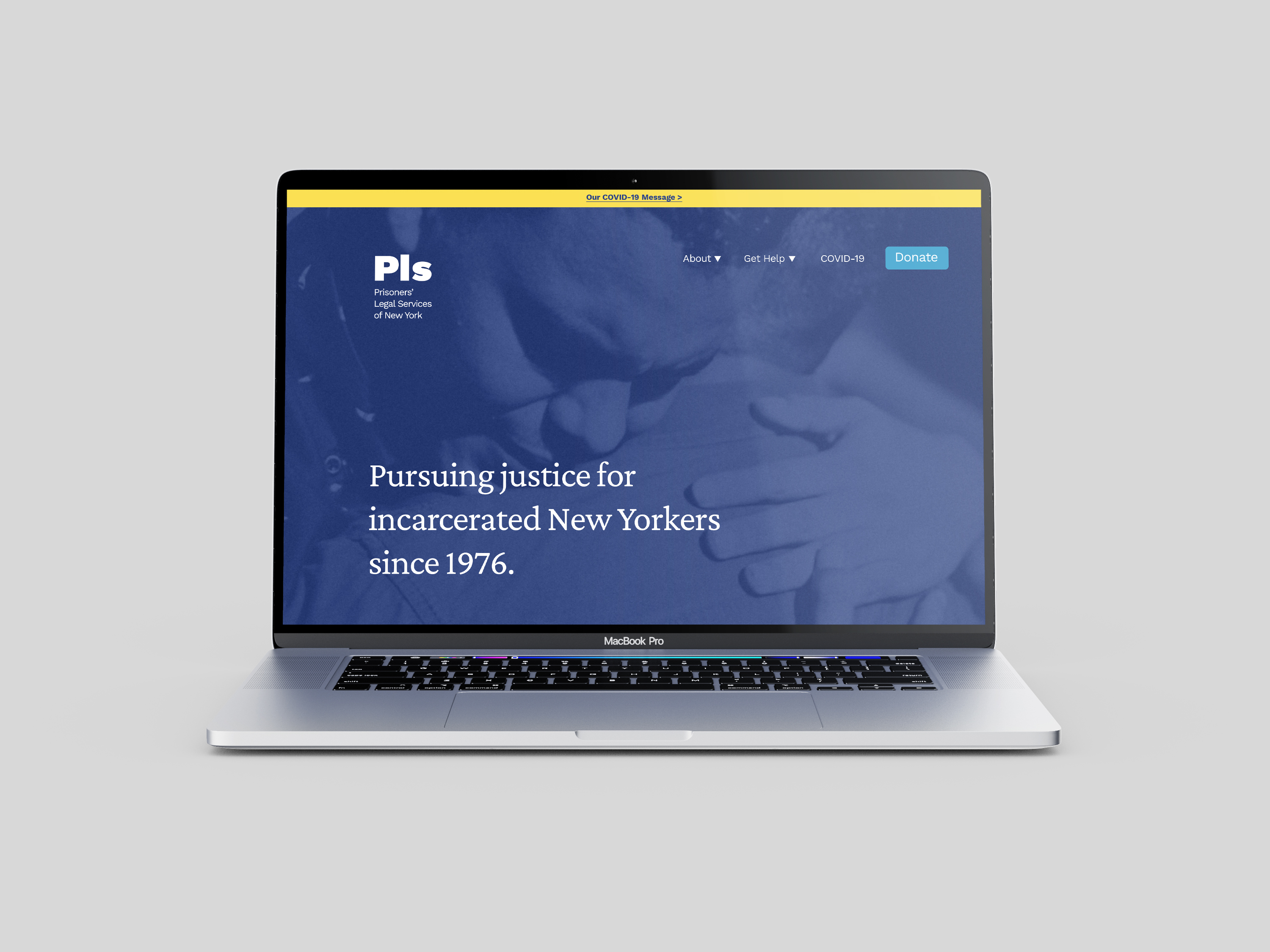
Over the course of 3-4 weeks I conducted a comprehensive discovery phase complete with branding workshops, discussions and an organization survey in order to carefully craft their visual brand system. With their clients, board and NY State in mind we uncovered meaningful messages that we wanted to tell through our design choices. Along the way, we focused in on three powerful traits that PLS embodied: trustworthy, dedicated and experienced. In the end I designed elements of the system such as a new logo, fonts, colors, hand writing, photography, and photographic treatment.
Services
Art Direction, Branding Strategy, Brand Design, Graphic Design

“Wendy was patient, thoughtful, creative and very easy to work with. She was also extremely prepared and timely in any promised deliverables. We are very happy with the final product. If you are looking for someone who will take the time to work with your organization to come up with a unique branding that conveys your purpose and mission, I would highly recommend Wendy!”
Karen Murtagh
Executive Director at Prisoners’ Legal Services
What we uncovered:
1. We bring justice to New York prisons. PLS focuses on the New York State prisons and the incarcerated individuals within them. We bring the courthouse to our clients and focus on addressing the issues they face. We were created out of the Attica uprising because, at that time, no one else was responding to the issues that led to the uprising. A big part of what drives us is to prevent another Attica.
2. Many small actions lead to big change. PLS engages in direct action. The majority of our work focuses on our individual clients. The letters we receive from our clients and the critical issues we work on are the core of who we are as an organization. The result of working on many individual client cases is broad systemic change that benefits all incarcerated New Yorkers.
3. We believe in humanity. We believe that PLS acts as a lighthouse– lighting the way for those that may find themselves in rough waters. We respond to our clients when no one else does, even when our answer is “I’m sorry, we can’t help you.” This is because we believe that they matter–that they count. We believe in their ability to raise themselves up and we try to give them every opportunity we can.

Before & After
Logo
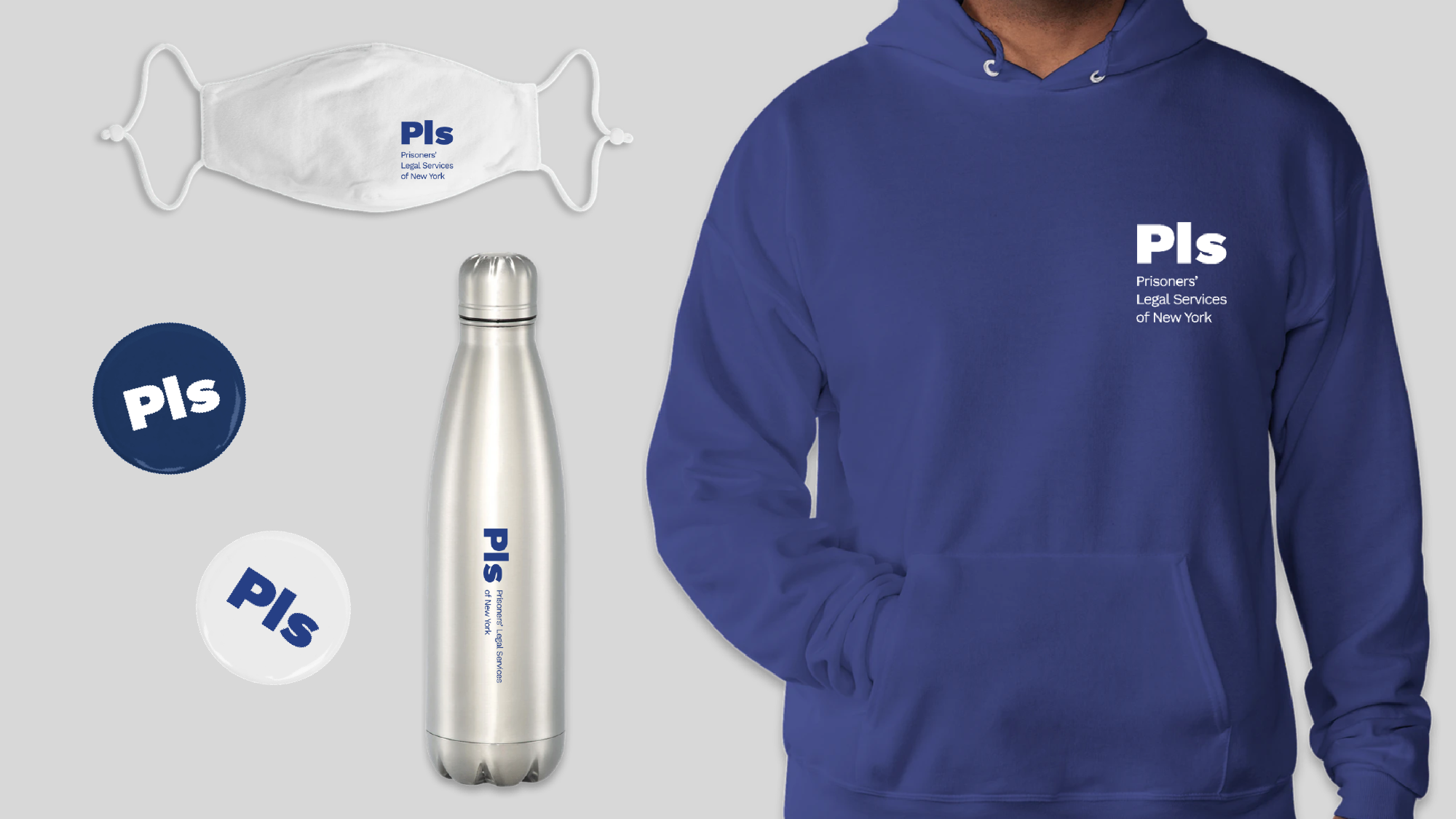
Two major goals of the logo redesign bring PLS into 2021 and make something that was simple and easy to reproduce. The new logo uses the abbreviation ‘Pls’ which is set in sentence case (the first letter is capitalized and the rest are lowercase). The use of sentence case tells the story of the actual letters PLS receives from their clients as nearly all of them written in sentence case.
‘Pls’ also can be read as a shorthand for the word “please”– a polite adverb embedded in correspondence from their clients. Finally, the sentence case design echos the often cordial tone and relationship PLS has with those writing to them.


Handwriting
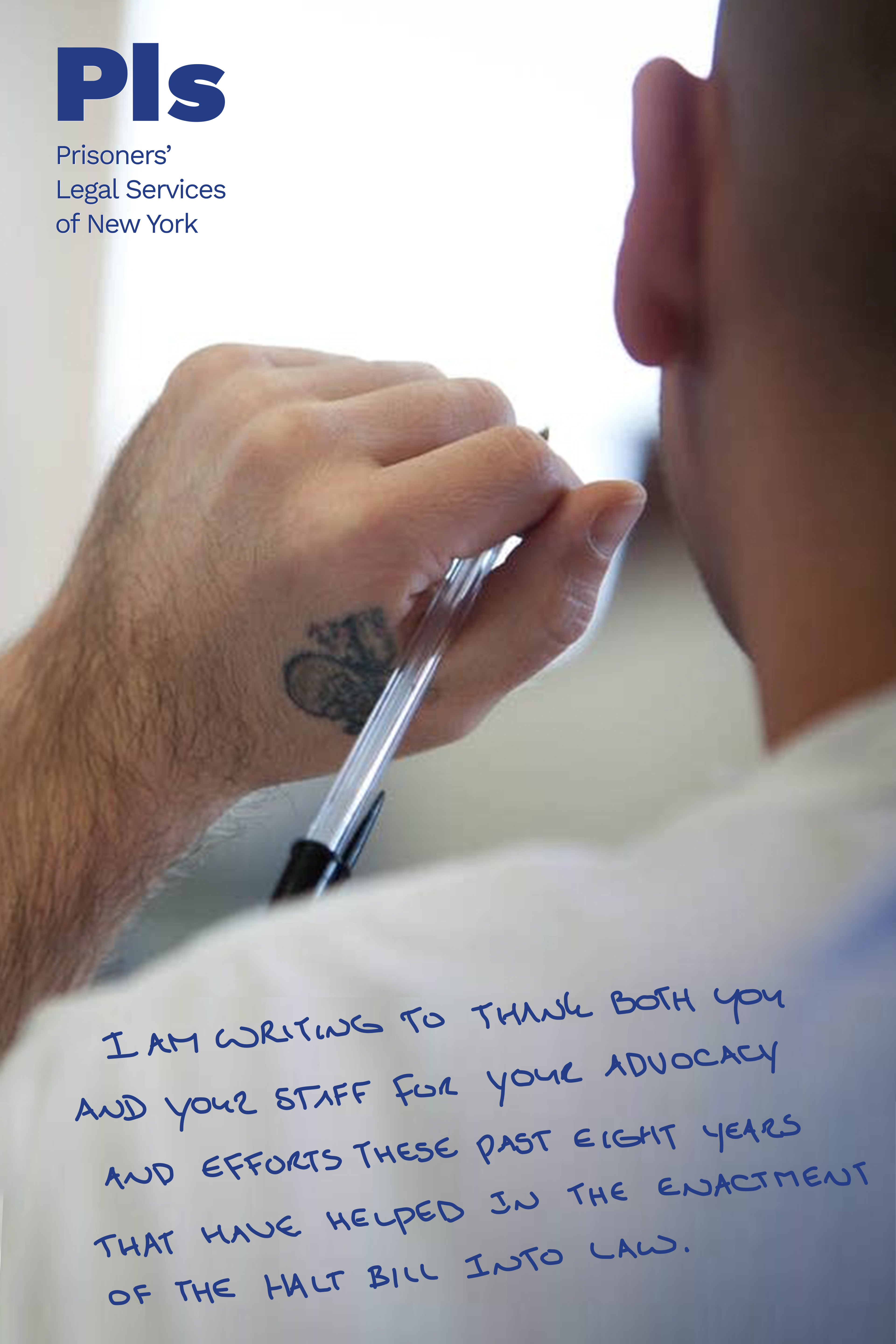
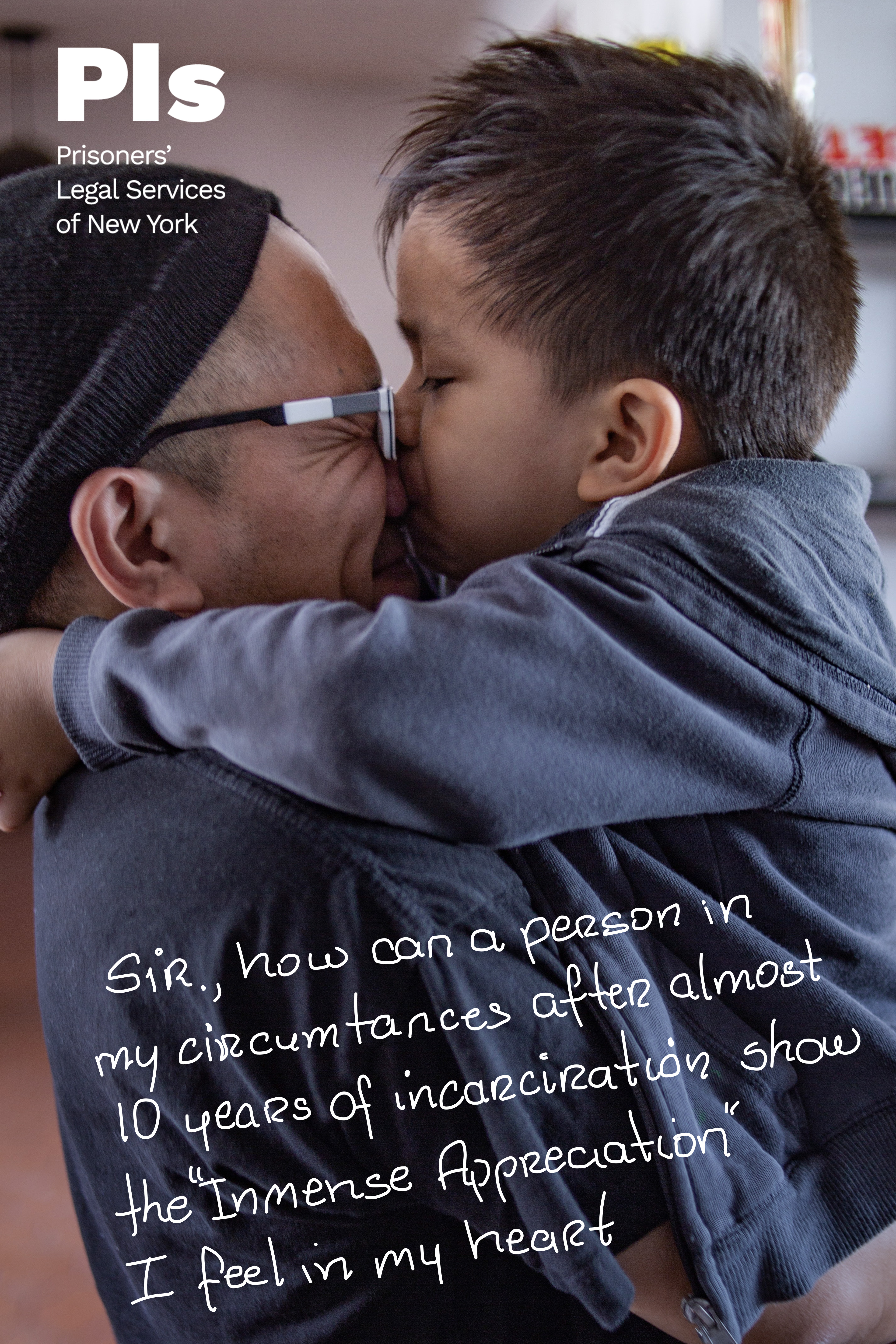
By using traced excerpts from the actual letters PLS receives, we could visually and emotionally communicate the central part of their work. By reading the words and seeing the handwriting of PLS’ clients, audiences get a direct window into the human side of incarceration. We chose to include this because it shares one of our most important values: we believe in humanity.


Color
Every design decision was made with great care and color was no exception. We selected the colors white and navy as the primary pallete. We chose white because it references the courthouses and thus the idea of justice. Additionally white, along with yellow, symbolizes PLS being the light/lighthouse that shows the way while the navy blue represents the ocean. The light blue represents the sky and the idea of looking up while teal is energetic and represents positivity.


Photography
The tone of PLS imagery is clean, optimistic and hopeful. We opted for bright, uplifting imagery over somber, dark imagery of law libraries, courthouses or prisons. In images of the courthouse, we chose images that direct the eye upwards especially if there is a blue sky visible. When it came to showing people, we used deeply compassionate and inspiring images instead of indifferent, depressing or hopeless ones.
The tone of PLS imagery is clean, optimistic and hopeful. We opted for bright, uplifting imagery over somber, dark imagery of law libraries, courthouses or prisons. In images of the courthouse, we chose images that direct the eye upwards especially if there is a blue sky visible. When it came to showing people, we used deeply compassionate and inspiring images instead of indifferent, depressing or hopeless ones.