Bridging the Gap
Case Study
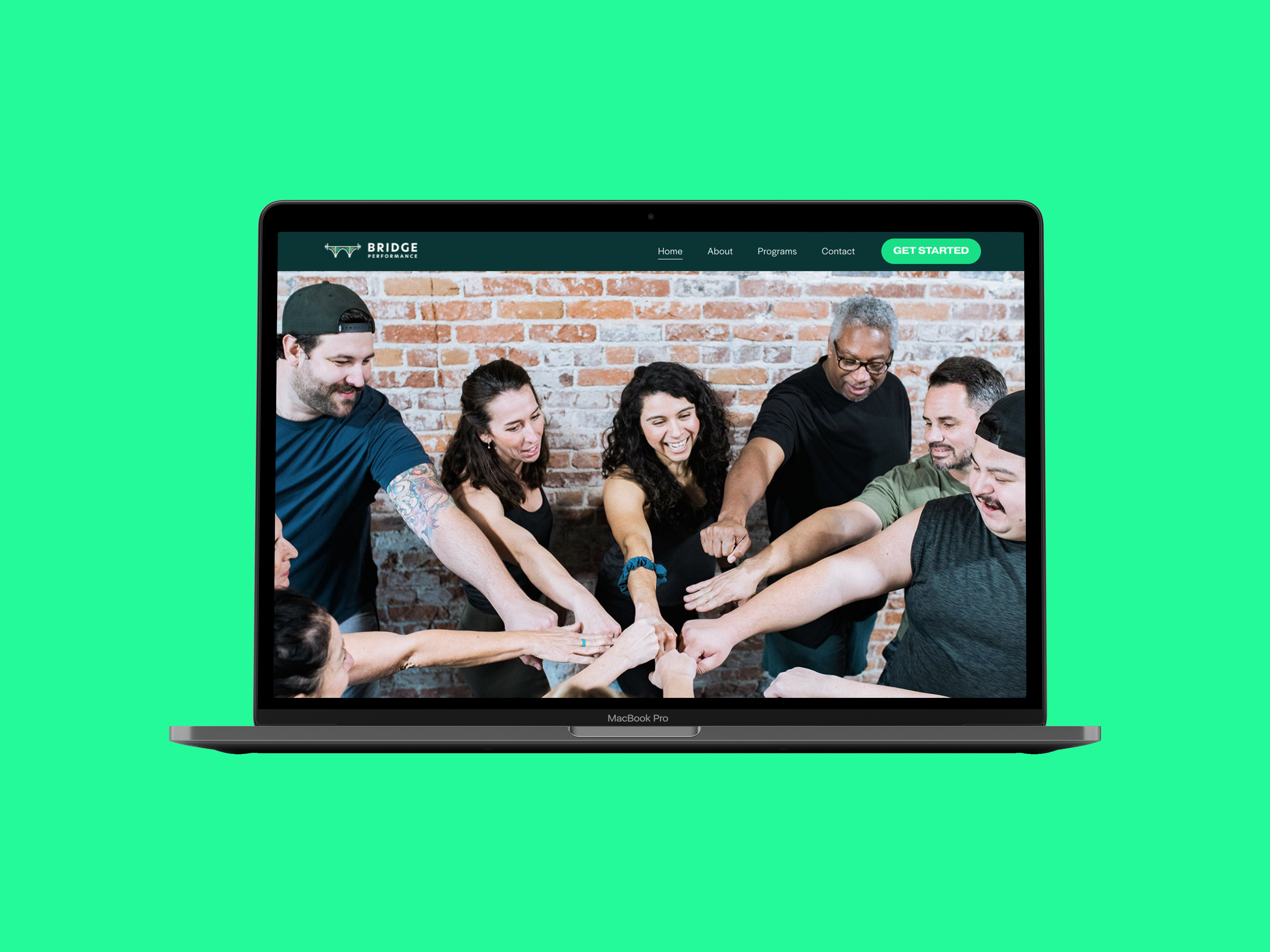
Co-founders Amy and Astrid and I worked together on a website to mark the launch of their first fitness and wellness gym. The website introduces their unique combination of community, strength training and physical therapy while making it easier for anyone—at any age or level—to join.
We wanted the website to not only to establish a virtual homebase, but to convey their expertise and generate new leads thus taking some work off of their extremely full plates. In the early days while Amy and Astrid spent their days securing their gym’s new address, I started the process. We aimed to make a website that would be at once beautiful, easy to use, and future proof.
Website
(We updated it in 2023)
Services
Brand Strategy, Art Direction, UX/UI, Web Design, Graphic Design
Photographer
Brianna Marico

“We had spent hours trying on Squarespace experimenting and found ourselves frustrated and overwhelmed by how many options there were. We had done branding exercises, but had no idea of how to communicate these things in a cohesive way that said who we were and what we offered.
That's when Wendy saved the day.”
Astrid Casteneda
Co-Founder of Bridge Performance

In The Beginning
Before any designing began, I reviewed their branding and facilitated conversations where we took a deep dive on their mission, vision and approach to training while paying special attention to what qualities make them unique.
One of those qualities was the way that Amy and Astrid strive to make an inclusive business where their clients feel seen and cared for. They founded their gym because they saw a common issue in the fitness industry where coaching and workouts often force people to conform to unrealistic and unsustainable standards that lead most people to burn out or give up. They had a different approach to completely change that.
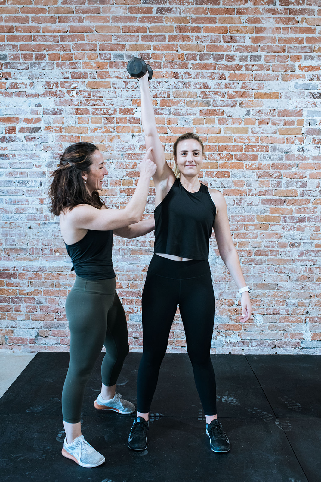
Bridge Performance uses a community based and holistic approach to training and they prioritize their relationships with their clients. They take the care and time to learn about their clients and explain things. If someone wants to lose weight, they don't want to just give them a diet and workout, but instead try and change their relationship with food. If someone struggles with accountability, social group classes are there to encourage, motivate and support them. If someone is experiencing pain, they don’t make them opt out of movement, but give them tailored exercises they can do to get out of pain.
In Amy’s words:
“It’s in the way we coach, communicate, educate, we don't want to just send you away sweaty, we want to make sure we are pushing you towards wellness autonomy.”

Learning more about our audience
Just as Amy and Astrid cater to the unique needs of their clients, the website was designed to address the specific needs of its visitors. The main mission of the website is to attract new clients. This started with identifying exactly who their audience is and what they look for in a gym.
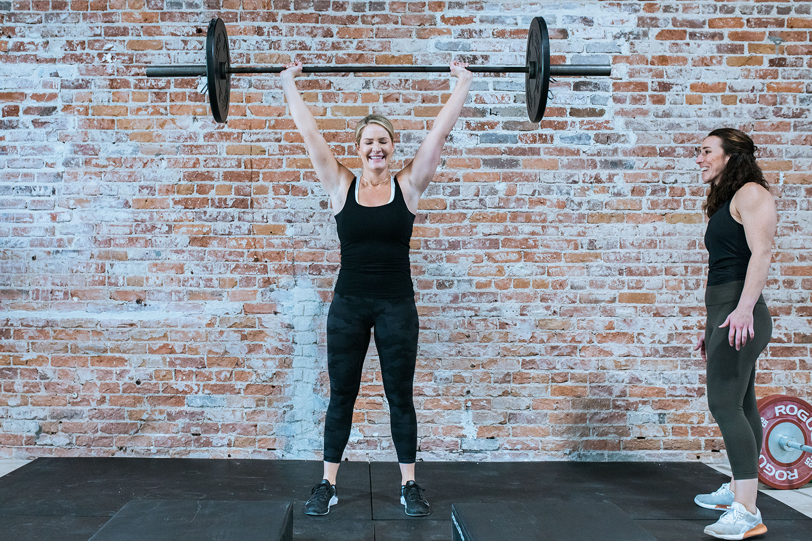
I started by conducting a workshop to create personas (fictional representations based on different types of clients) to understand their audiences' different needs. Amy and Astrid already had a group of very dedicated clients, majority of which identified as female. These individuals were ready to join Bridge Performance, so we created one persona to represent them, another for semi-regular clients and a final persona for new potential clients. The potential clients would ideally include everyone, but to get specific, we developed this third persona to represent people over 50 years old who have heard of BP through word of mouth and were interested in learning more. Through the workshop, we discovered that they view fitness as anti-aging and are very keen to have a workout routine. They have a fitness mentality that “an object in motion stays in motion and an object at rest stays at rest”. However, the overwhelming majority of this group find weightlifting very intimidating and want to feel comfort, safety and very personalized instruction.
The goals for the website really took shape after the workshop and we made it an objective to be inclusive of older individuals especially because much of the fitness industry either overlooks or completely erases them. We believe that when you see yourself represented, you feel seen and welcomed so we gathered authentic testimonials from clients over 50 and used inclusive language and photography.
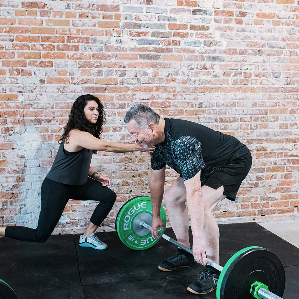
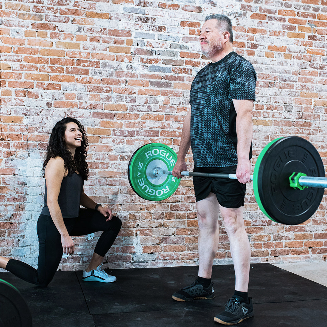
We showcased their client Shelly–a 72 year old woman who had two total knee replacements–and used her image and testimonial on the homepage. We set up a photoshoot where we used Amy and Astrid’s real clients who spanned all ages and backgrounds. We featured older clients working out in group classes amongst younger clients and participating in all aspects of the gym culture.

“Wendy took the time to get to know us, our business and where we wanted the business to go.”
Astrid Casteneda
Co-Founder of Bridge Performance
Positioning
Bridge Performance’s existing branding had attributes like fresh, strong, energetic and vibrant. While we kept to those adjectives, we wanted to position the brand as warm, inclusive and welcoming.
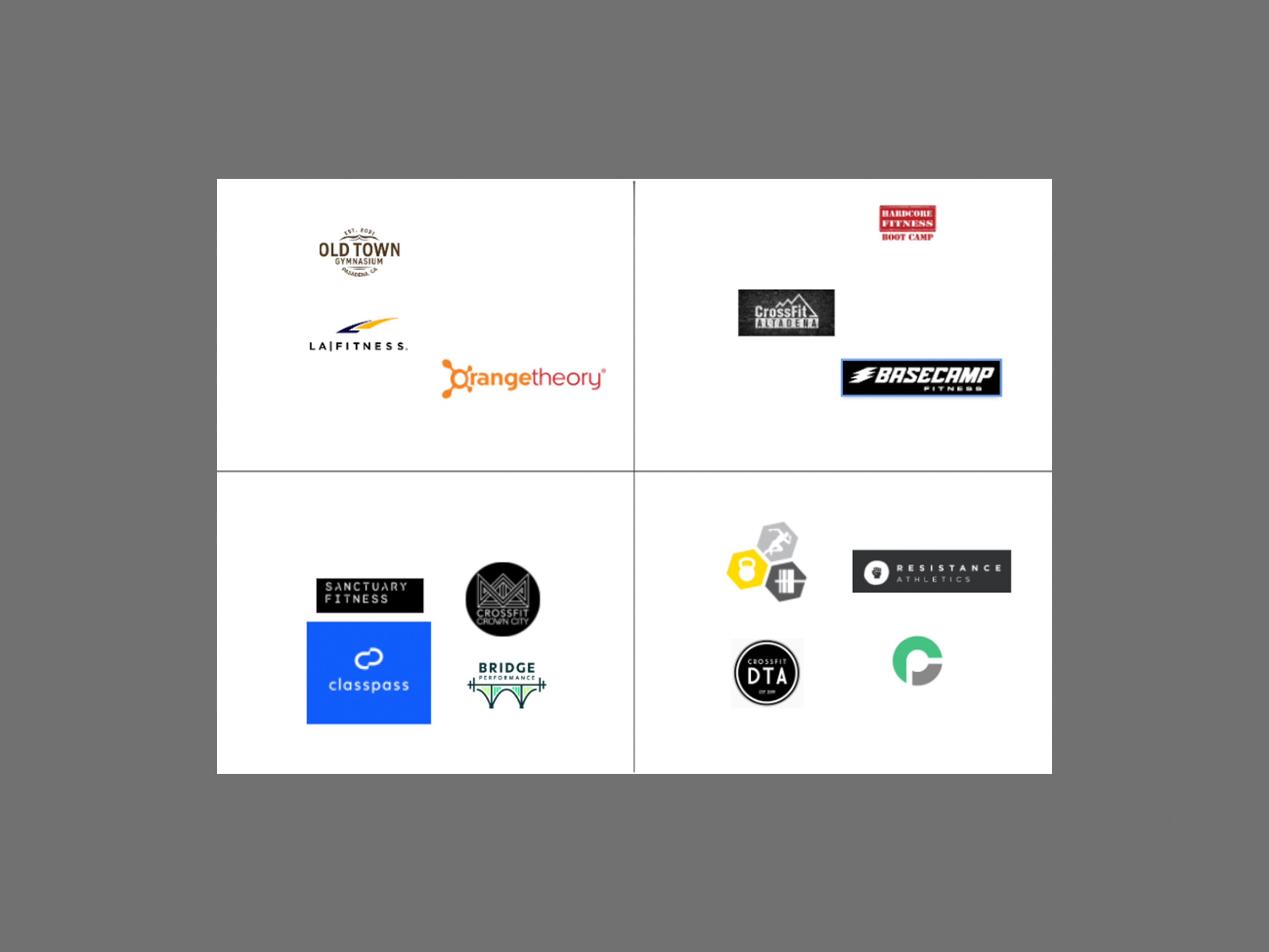
After a quick market analysis of 12 national and local fitness gyms, we conducted a positioning workshop to understand how Bridge Performance could stand out in the market. We found that on the national level we were strongly aligned with a brand like Classpass whose website felt modern, friendly and easy to use, while we opposed brands like LA Fitness which felt dated, uninspiring and conventional. On a local level, we were felt closest to Crowncity Crossfit and Sancuary Fitness and furthest from Hardcore Fitness Pasadena. We gravitated towards Crowncity Crossfit’s messaging and photography which felt uplifting and inclusive. Meanwhile we were polar opposite to Hardcore Fitness Pasadena which felt extremely aggressive, intimidating and intense.

Moodboarding
Next, we took what we learned from the positioning and moved to clarify our approach through moodboarding. We collected visual examples of branding, photography, typography, color and graphics that resonated with the BP brand. These examples served as our Northstar–they inspired us, aligned us and most importantly influenced our website’s look and feel.
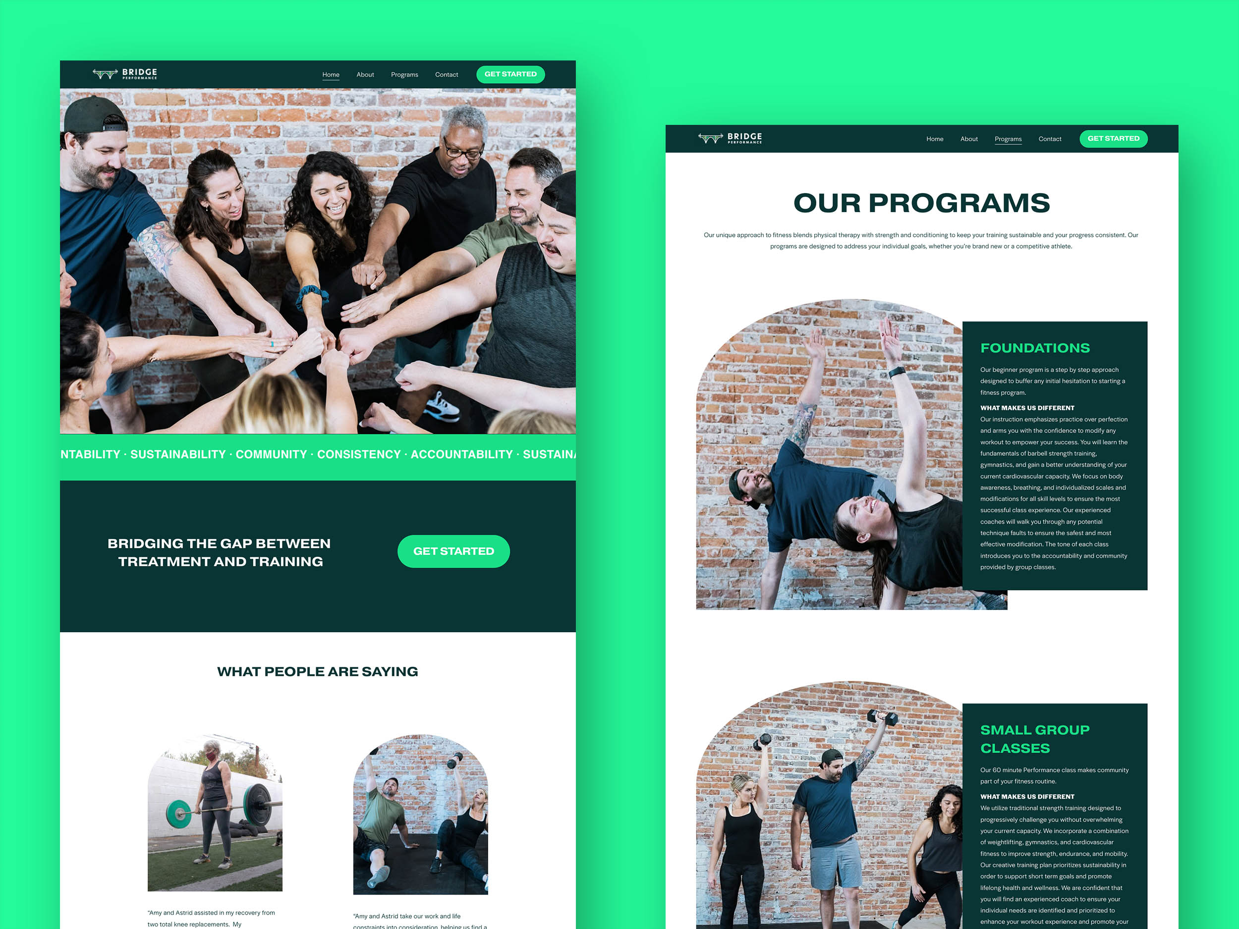
Site Structure
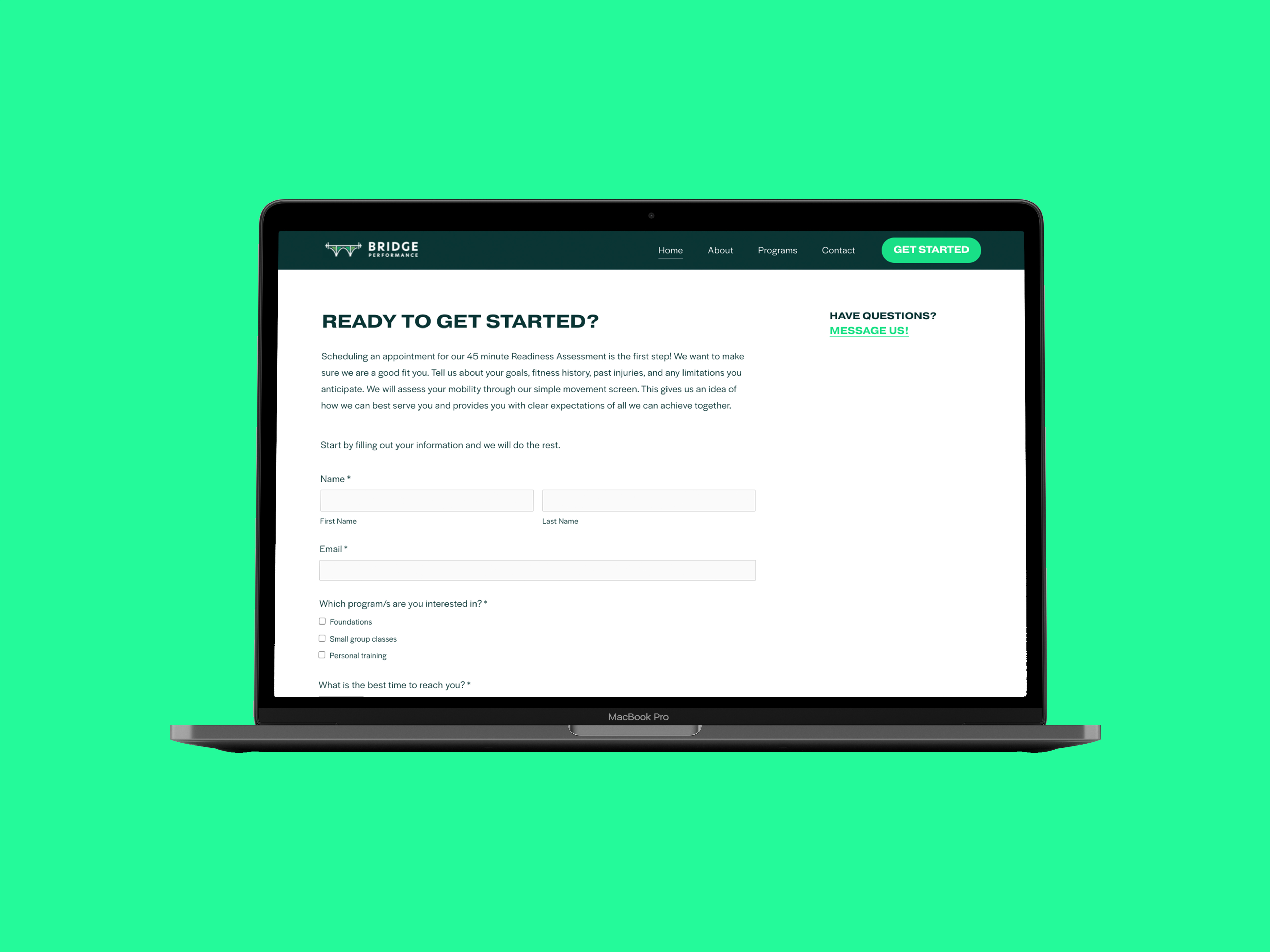
We put our target audience of prospective clients into two groups and tailored the website to suit both of them. Since the majority of the website was designed for newcomers, we placed a “Get Started” button frequently throughout the website. The homepage served as both a landing place and a filter for both audiences to find what they needed. Those who want to dive deep and learn more about Bridge Performance before they make the decision to join, can read about the various programs, the backgrounds of Amy and Astrid and the philosophy of the gym itself. We categorized this group as “divers” because they would likely take the time and read everything. The second group we referred to as “swimmers and skimmers”, these were people that were interested and perhaps had specific information they were looking for, but wouldn’t spend the time to read everything. Because of this group we kept to strict word counts, used large titles and succinct summaries followed by detailed descriptions for efficient browsing.

Design
From their brand colors, we selected the energetic lime green as an accent color to draw attention to titles and links. We paired this with background colors like white and a neutral forest green.
For typography, we went with a large modern bold font for titles and statements. For body copy and details, we contrasted the title font with a friendly, round, wide font. We kept all buttons large so they command attention and feel prominent.

The Bridge
All prospective gym members would likely be local residents of Pasadena, thus it was important to make reference to Colorado Street Bridge–which is featured prominently in the logo and in the story of the Bridge Performance. The bridge not only was a metaphor to bridge training with therapy, but Pasadena locals feel a sense of belonging and ownership after seeing it. For example, after seeing the Bridge Performance logo, they would say things like: “This is my city, this is my gym.” To subtly make reference to the bridge, we used an arched shape to house some of our images.


Photography
Photography did a lot of the work in communicating Bridge Performance’s brand values, especially those of community and positivity. Working with photographer Brianna Marico, we captured people who represented a diversity of age, body type and race. We focused on capturing people in action, smiling, and interacting with each other. One of our objectives was to make ordinary people look momentous and powerful through the use of perspective, breaking the mold of unrealistic fitness standards.
We focused on getting images of Amy and Astrid working directly with their clients–making hands-on adjustments and encouraging them– thus capturing their coaching abilities and their love for what they do.